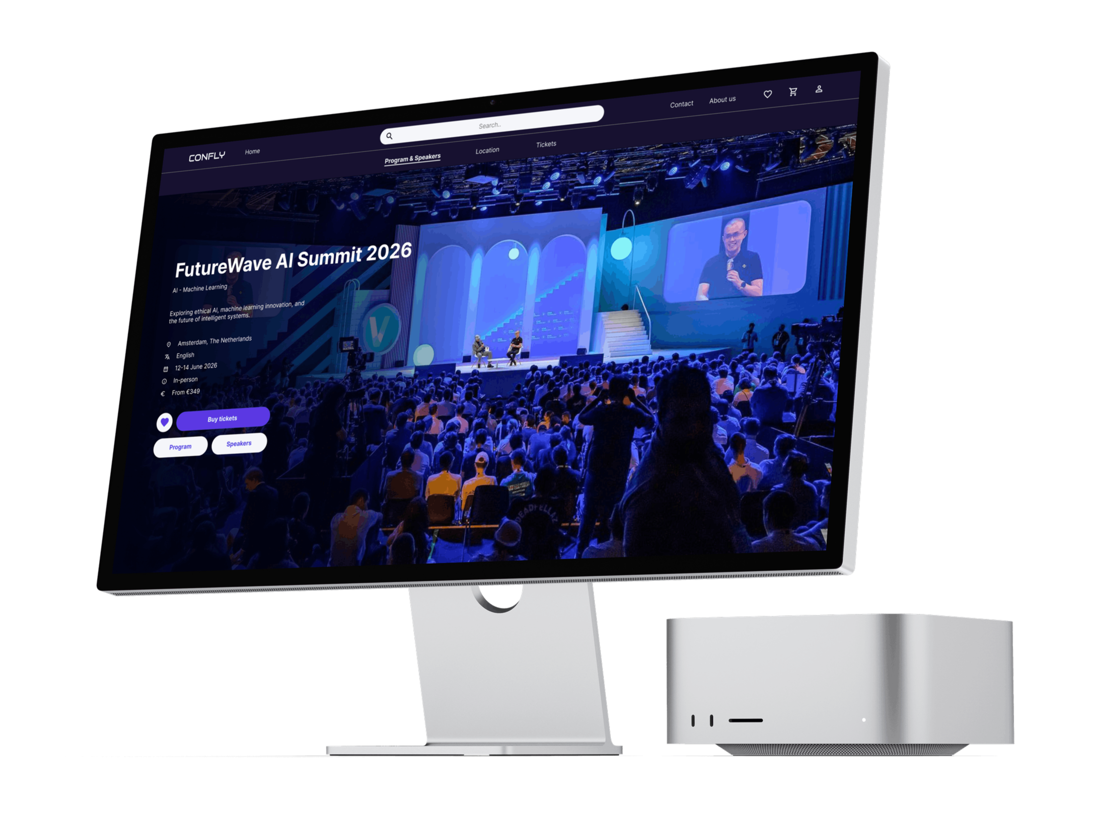
Confly
Where
Amsterdam, The Netherlands
What
Desktop website
Why
Google UX Design Course, Portfolio Project
Role
Designer, Researcher
When
Feb. 2026 - Mar. 2026
QUICK OVERVIEW
01. The Problem
Tech enthusiasts and professionals struggle to find relevant conferences in one place. Information about schedules, speakers, and tickets is scattered across individual event websites, making it time-consuming to discover and compare events.
02. The Solution
Confly is a desktop platform that centralizes tech conferences in one place, allowing users to browse events, explore schedules and speakers, and purchase tickets, all without leaving the site.
03. The Design of the Most important screens
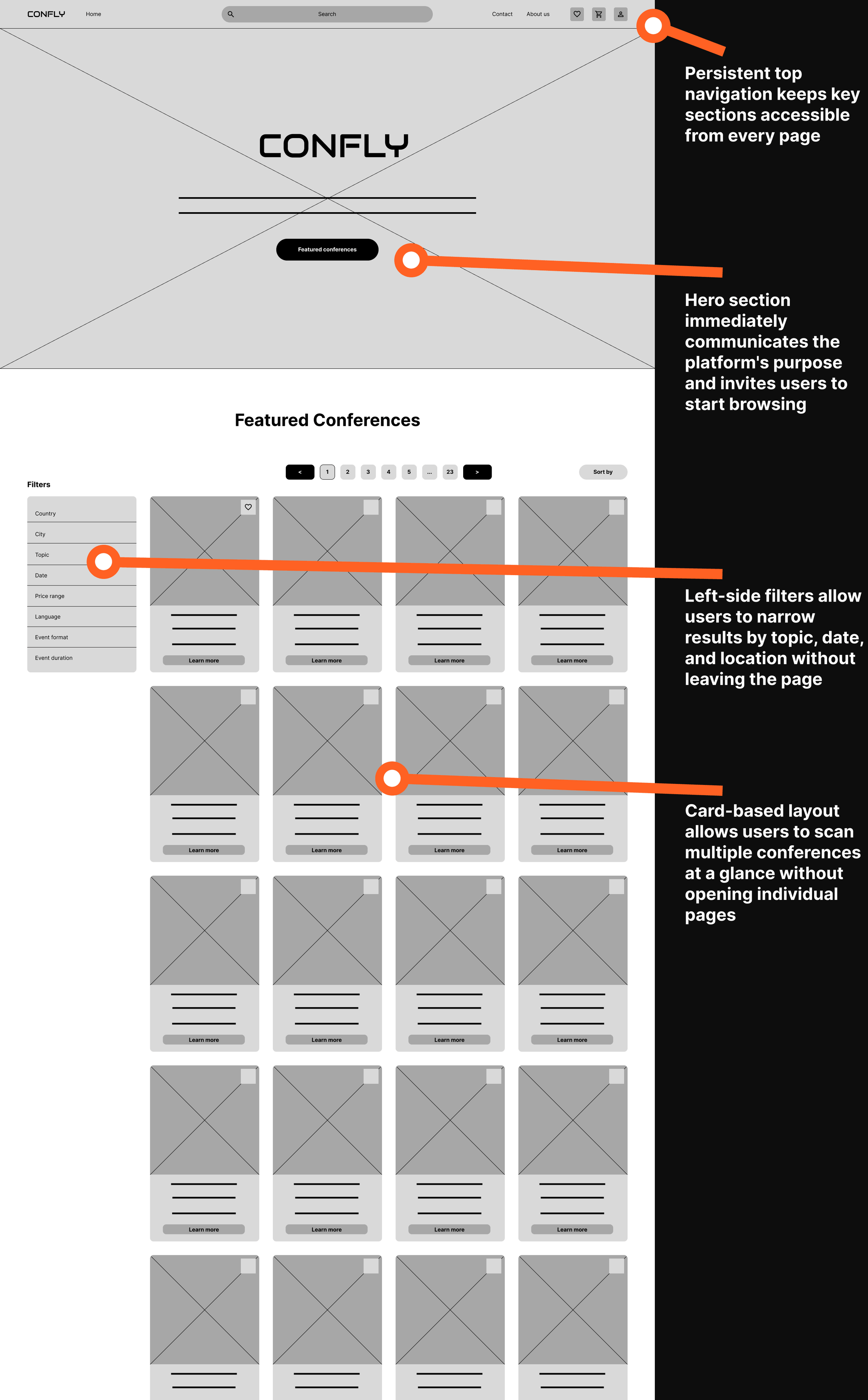
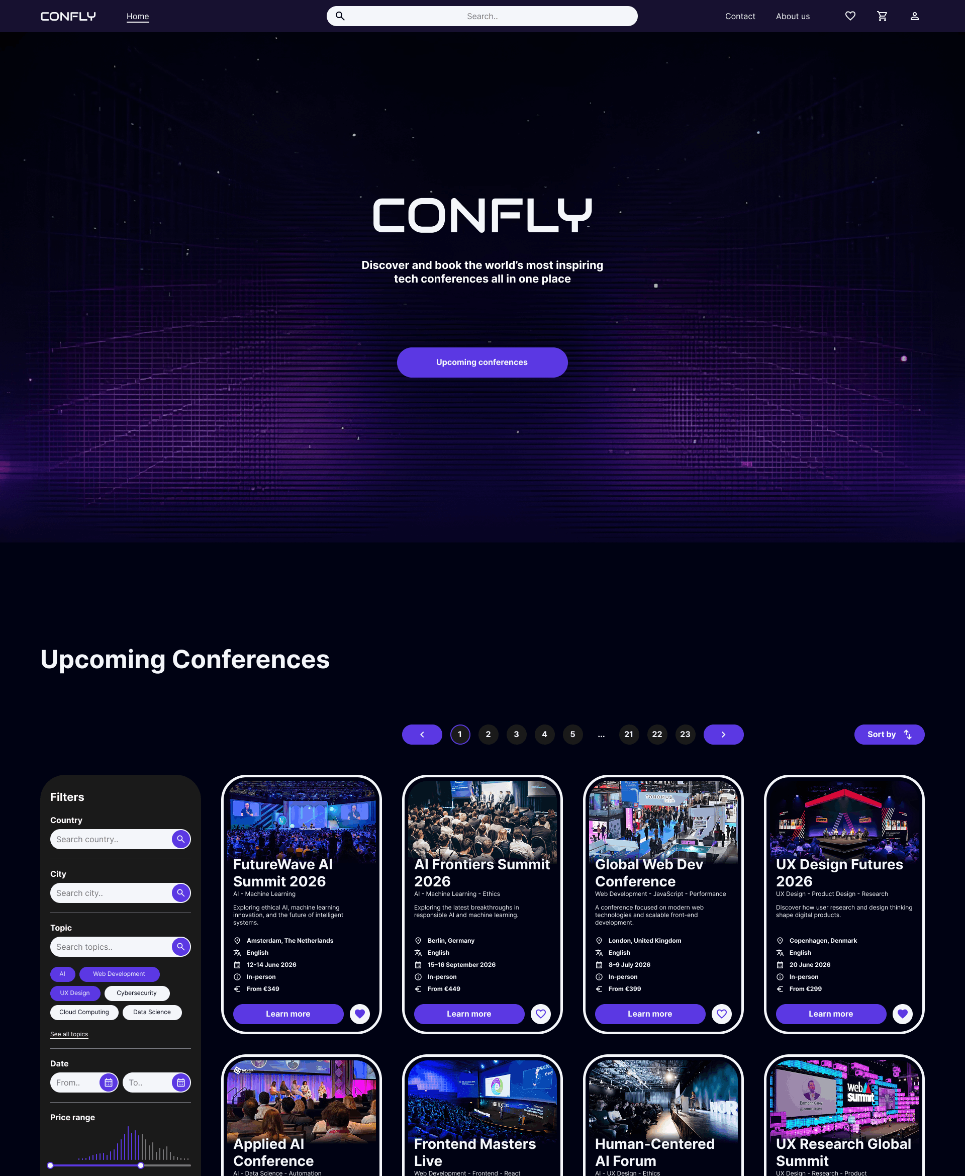
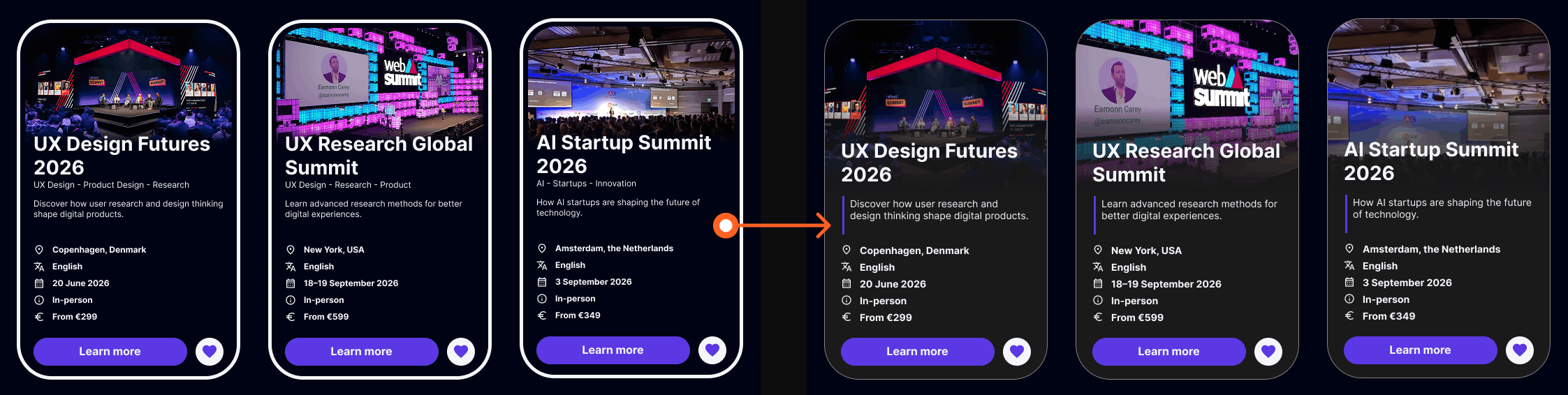
A. Homepage
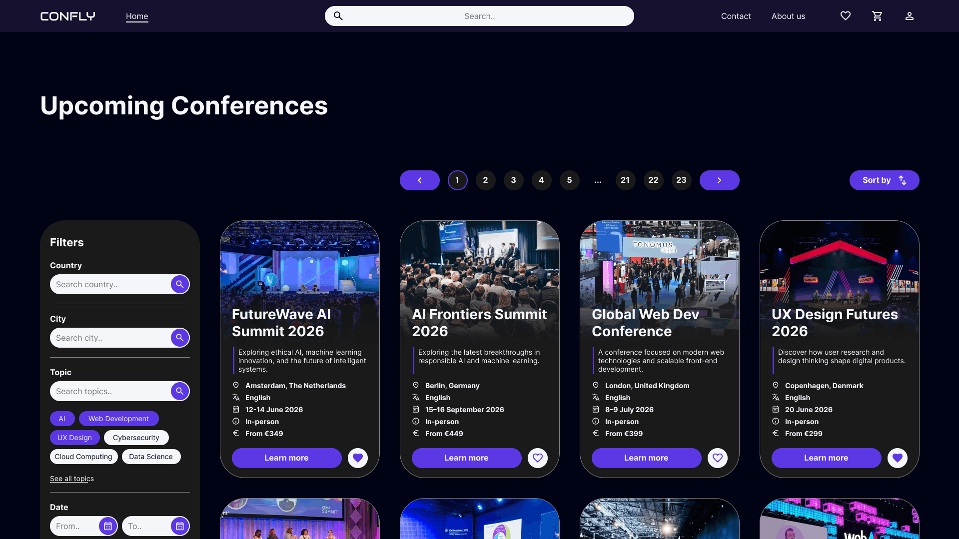
The search bar is placed at the center of the navigation, making it the most accessible action on every page.
A large conference image at the top of each card gives users an immediate visual impression of the event before reading the details.
Consistent use of icons makes conference details scannable at a glance without having to read every line.
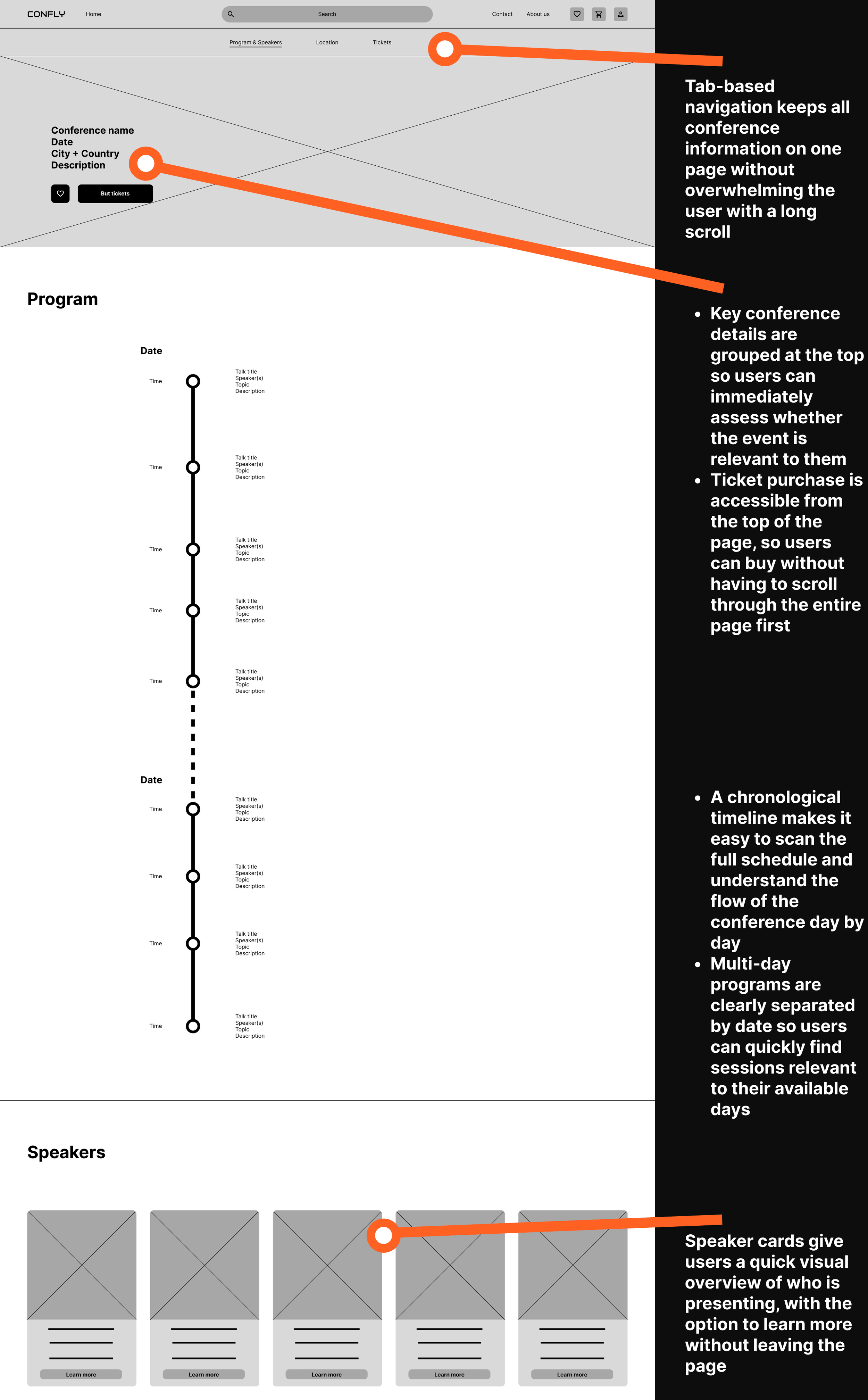
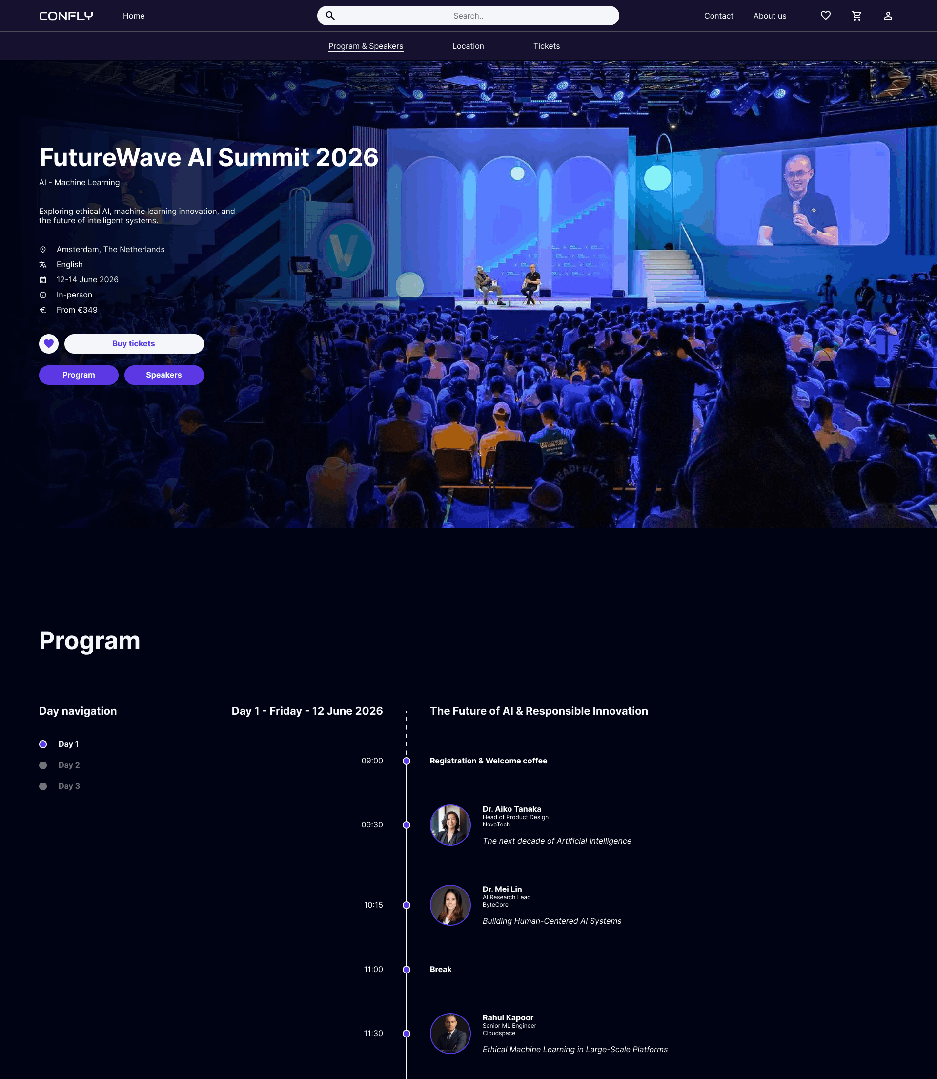
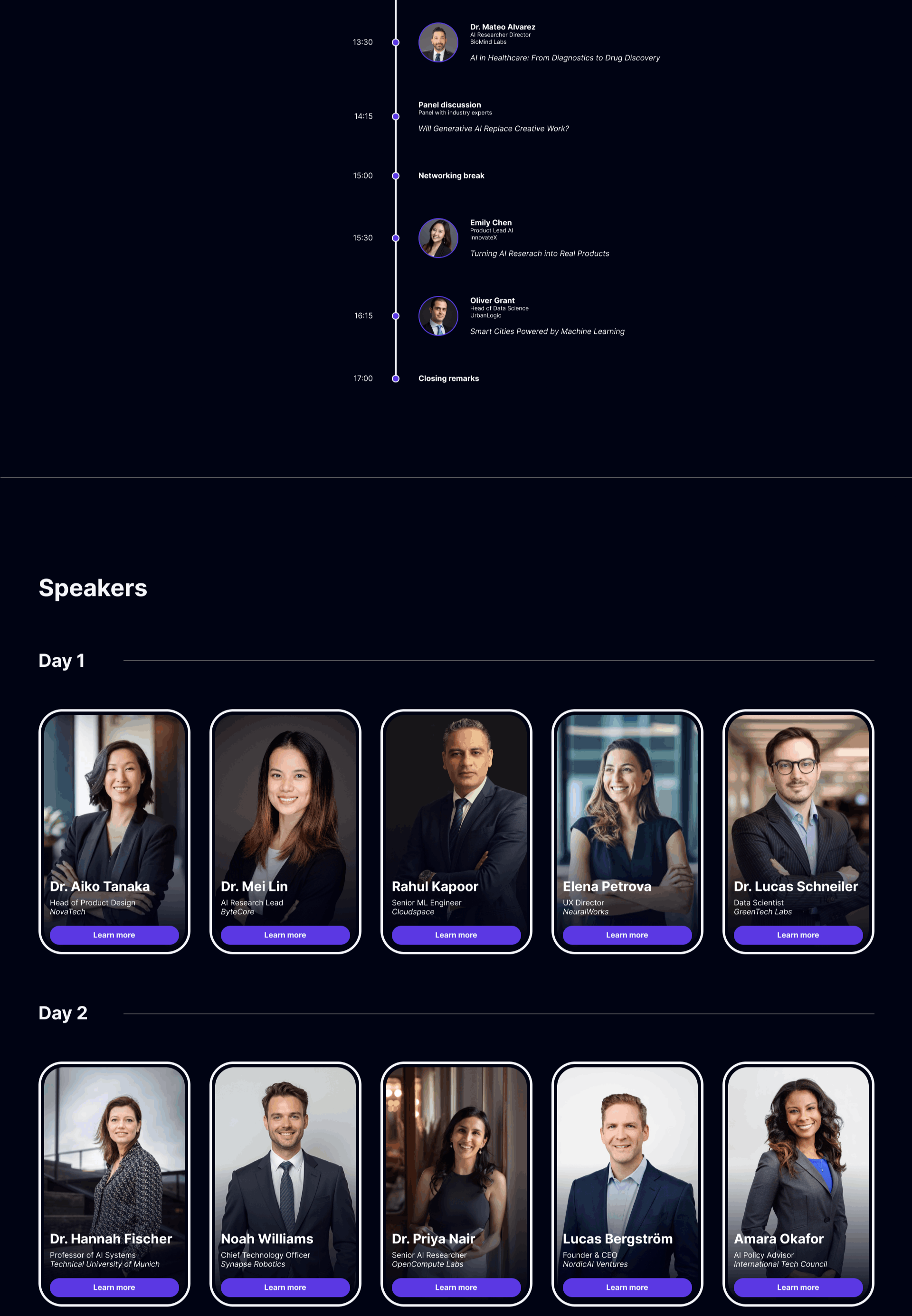
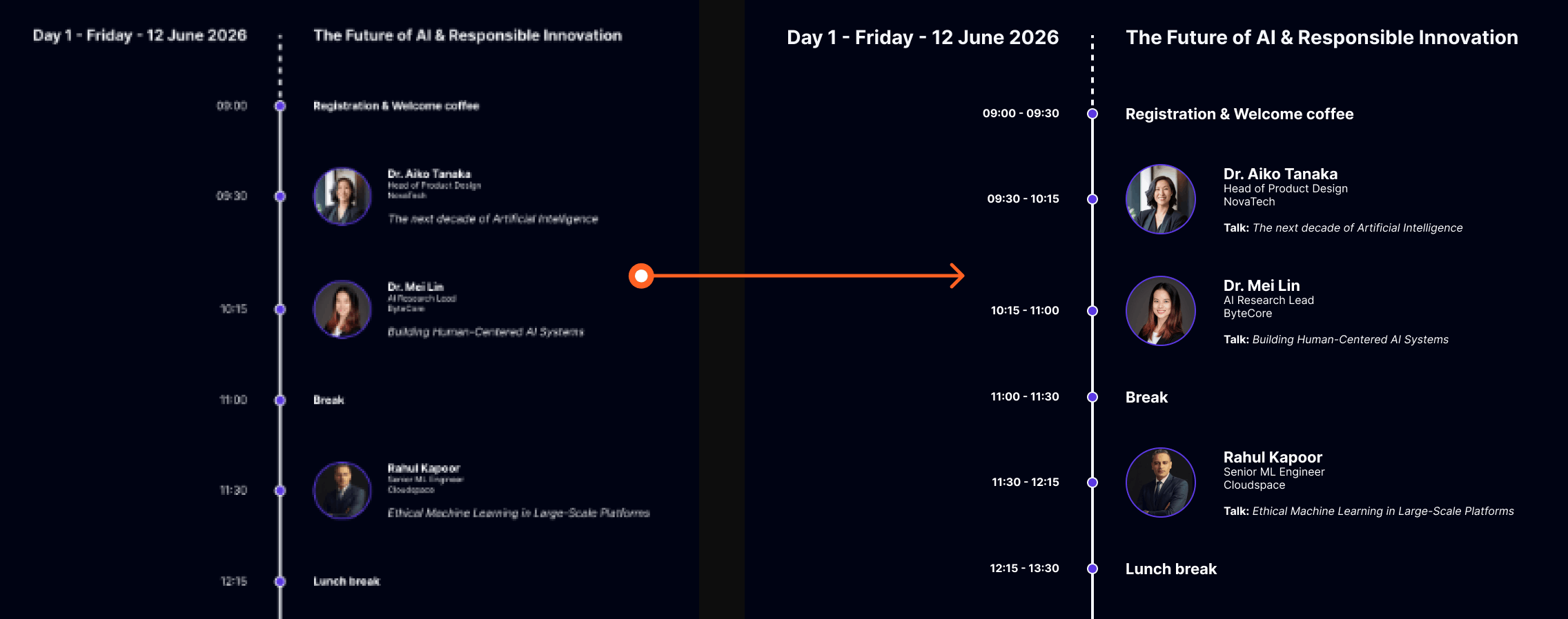
B. Program & speakers
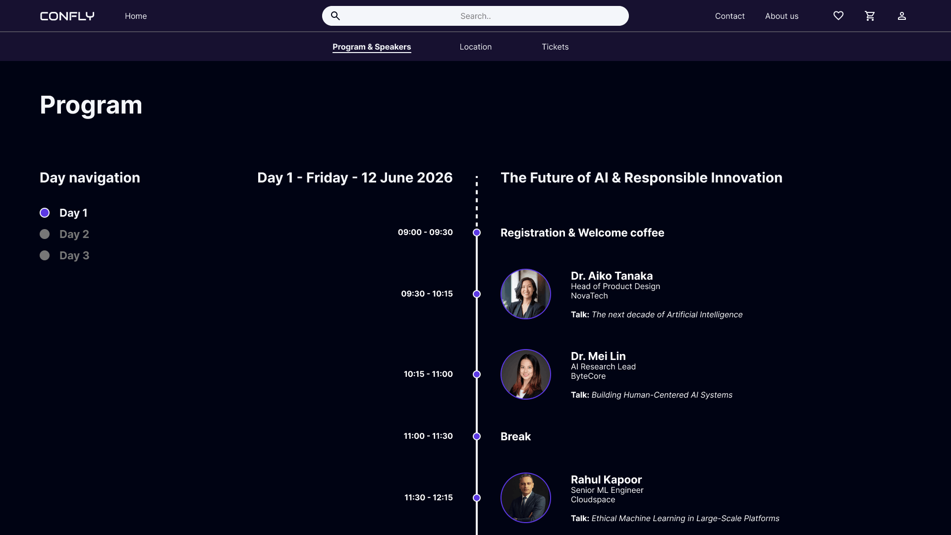
Left-side day navigation allows users to jump directly to a specific conference day without scrolling through the entire program.
Displaying both start and end times gives users an immediate sense of each session's duration.
Integrating speaker information directly into the timeline eliminates the need to cross-reference a separate speakers section.
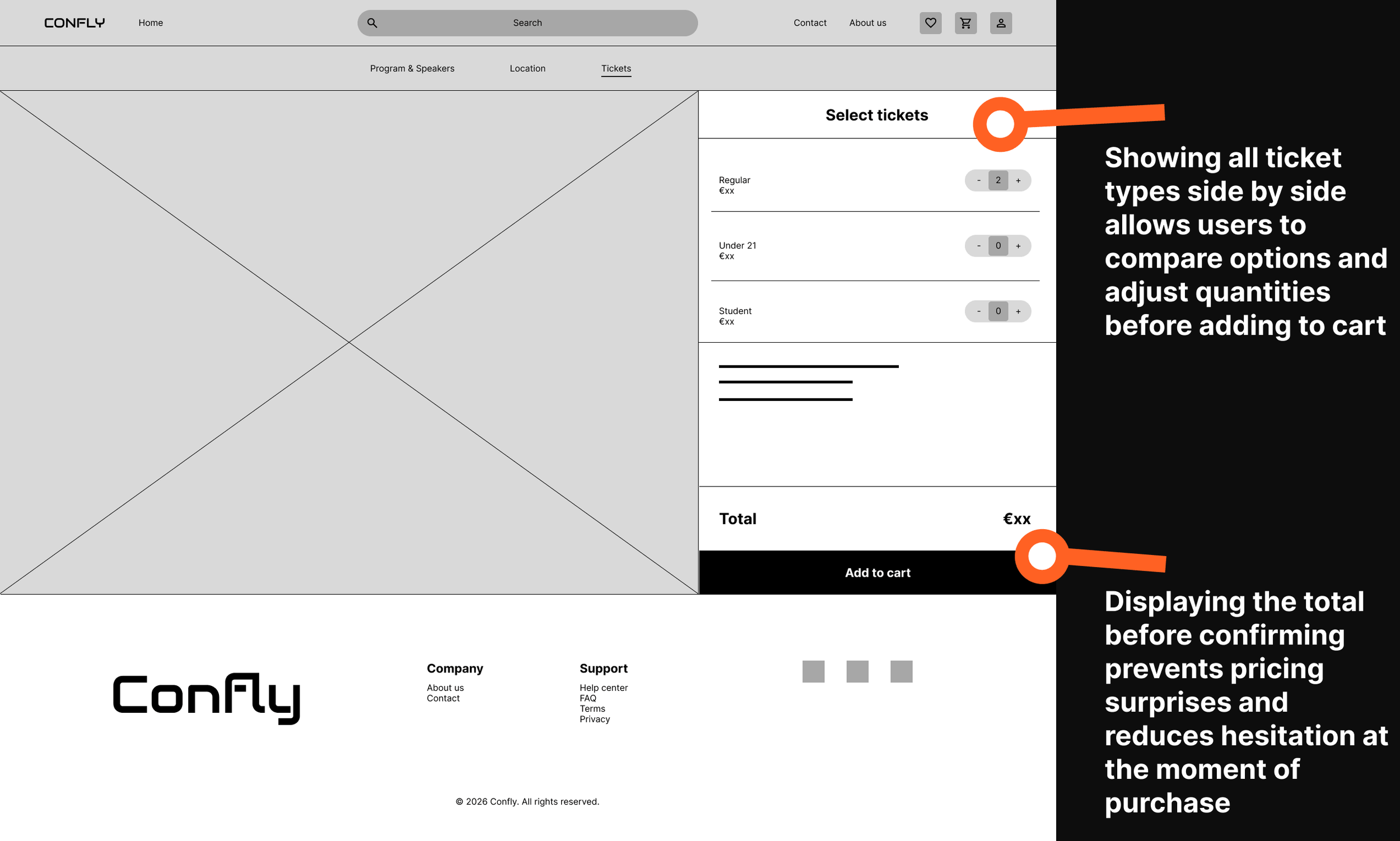
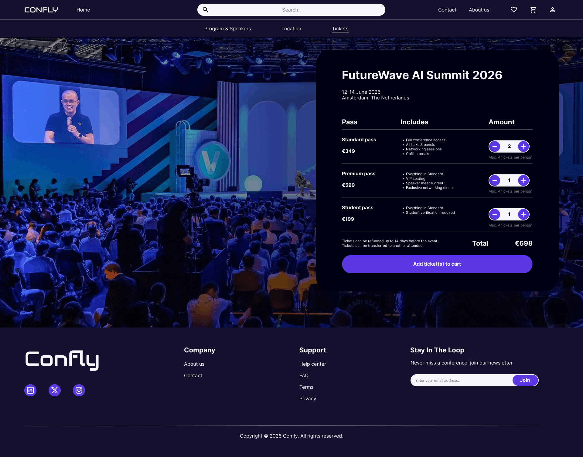
C. Tickets
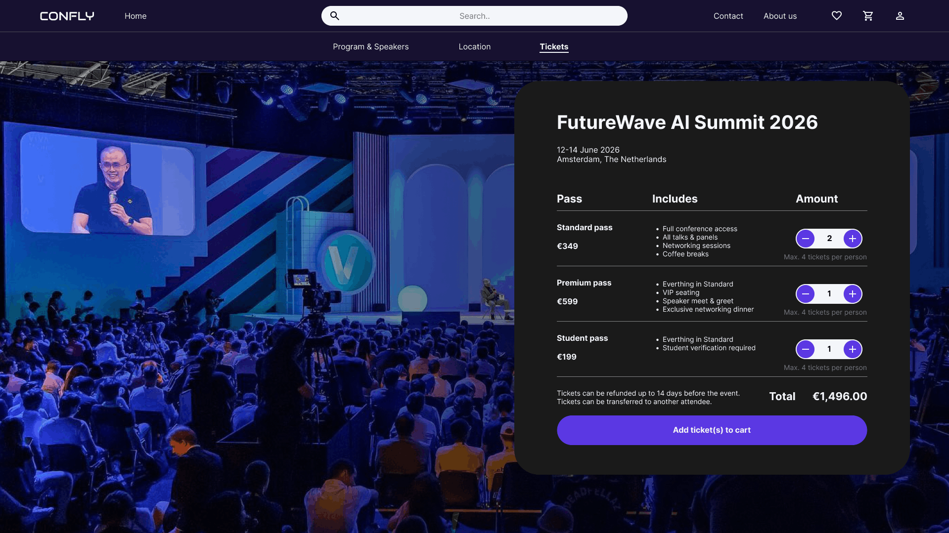
The ticket selection panel overlays the hero image, keeping the conference atmosphere visible while focusing attention on the purchase action.
Listing what each pass includes allows users to compare options and choose the right ticket type without navigating away from the page.
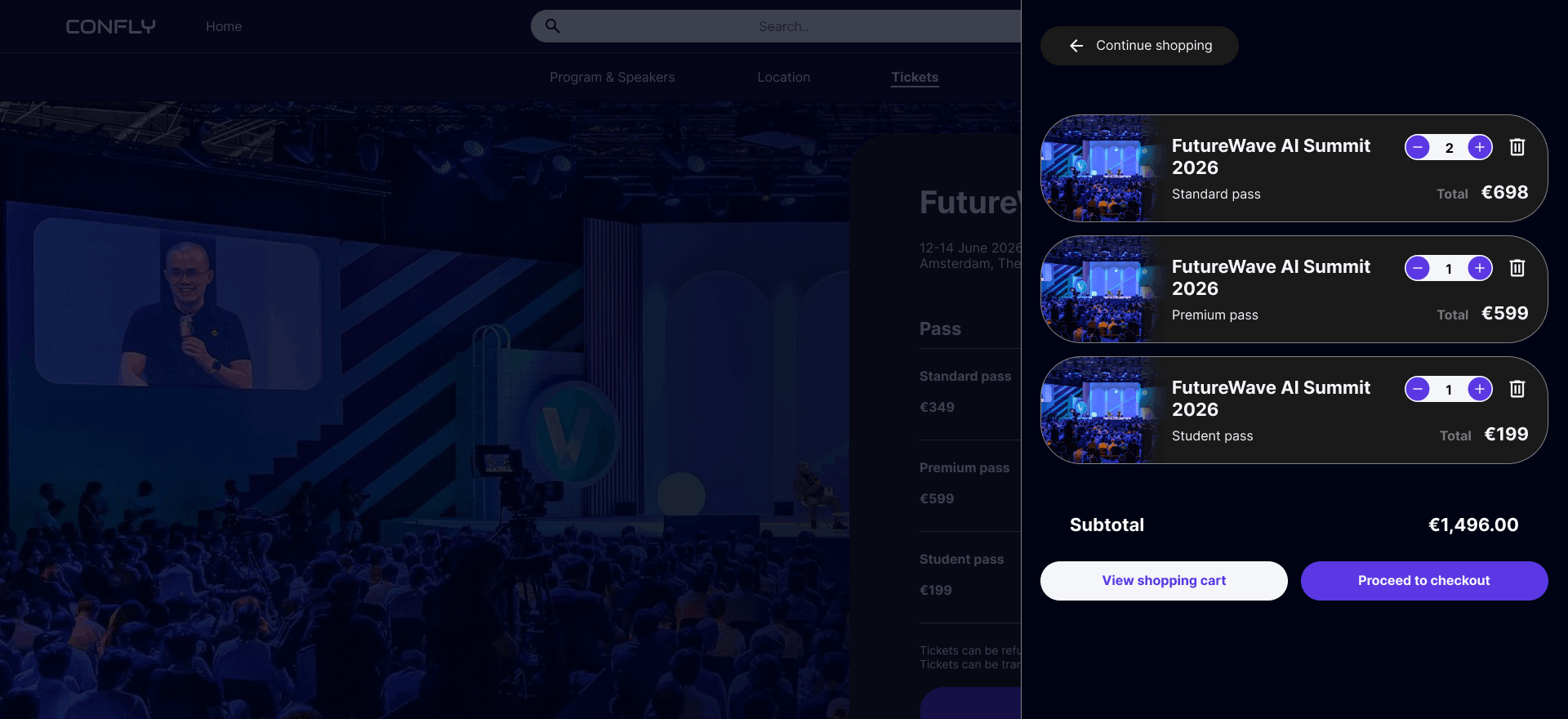
Quantity controls per ticket type allow users to purchase multiple tickets of different types in a single transaction.
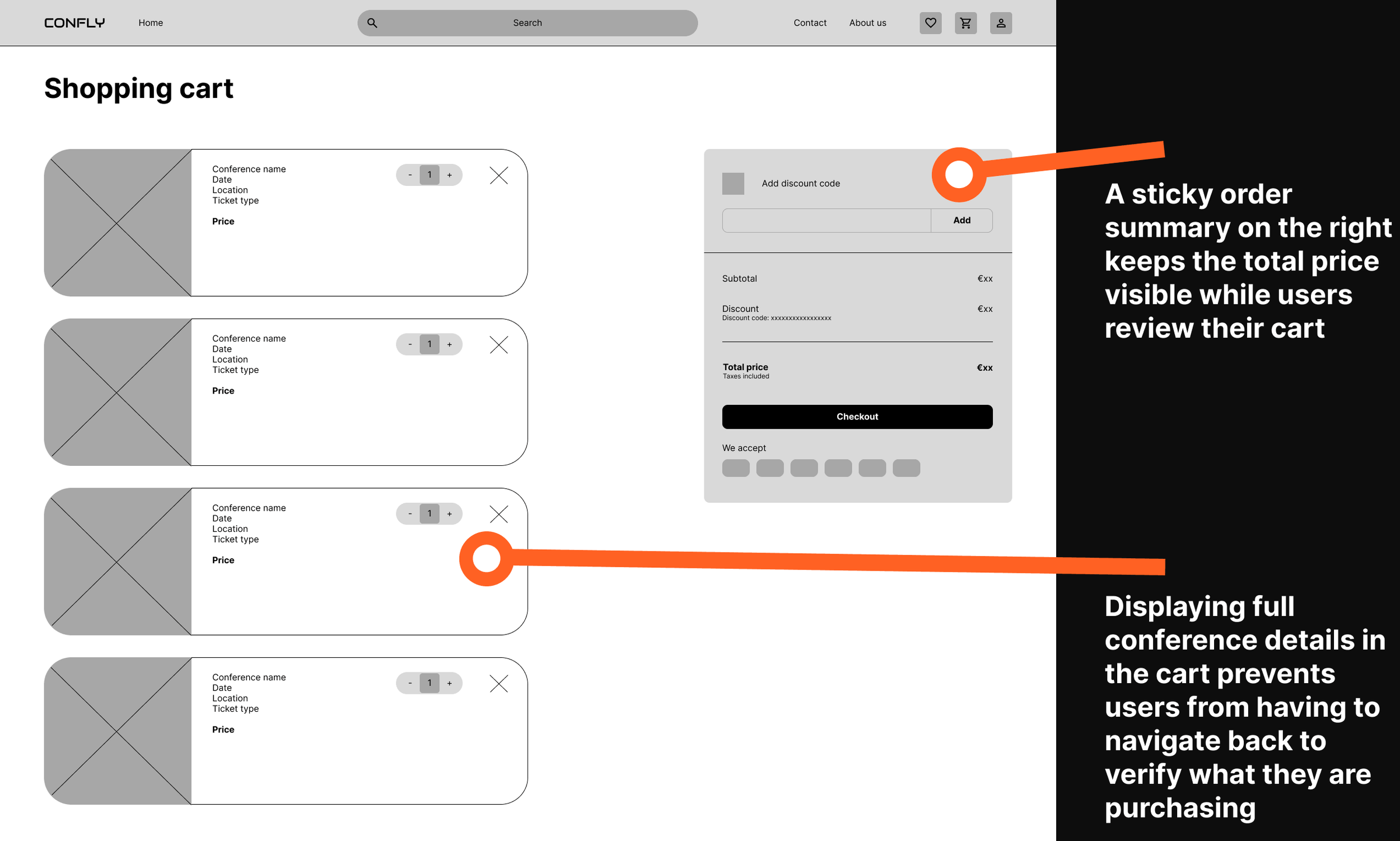
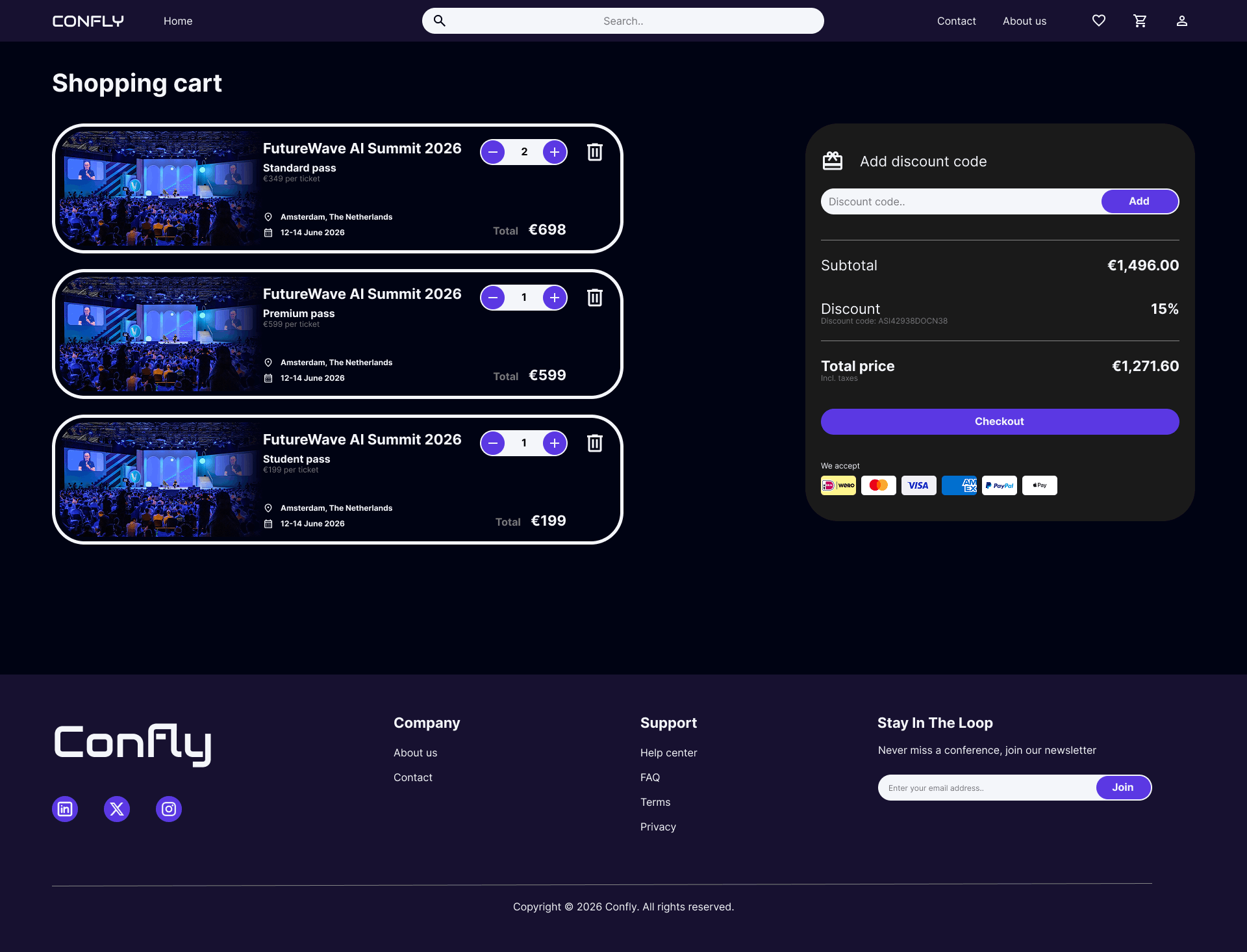
D. Shopping cart
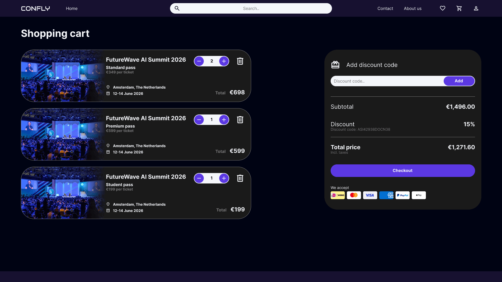
Displaying full conference details in the cart prevents users from having to navigate back to verify what they are purchasing.
Quantity controls in the cart allow users to adjust the number of tickets per ticket type without starting the purchasing process over.
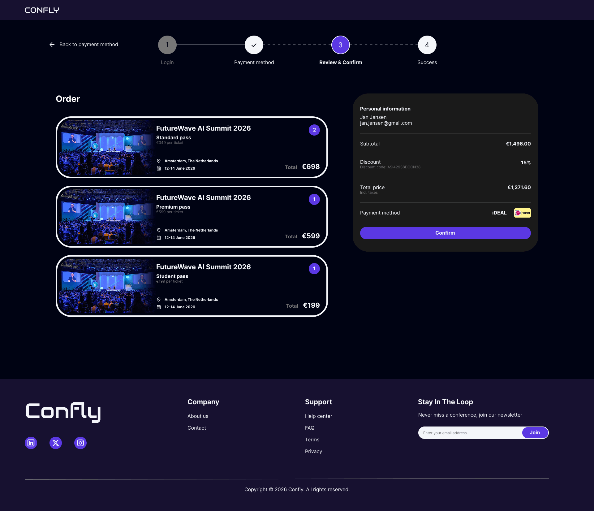
Breaking down the price into subtotal, discount, and total makes the final amount transparent and builds trust before checkout.
Want to go in deep?
Full case study
00. Before we start
This project originated from the Google UX Design course on Coursera, where designing a conference ticket booking website was one of the suggested prompts. Because the project brief was predefined, no prior user research was conducted. The pain points and personas in this case study are therefore assumption-based proto-personas rather than research-validated. However, both rounds of usability testing were conducted with real participants, grounding the design iterations in genuine user feedback.
01. Overview
The project
This project is a desktop website designed to help tech enthusiasts and professionals discover and attend conferences in their field. Users can browse and filter events, explore detailed information about schedules and speakers, and purchase tickets, all in one place. The platform aims to reduce the time and effort spent searching across multiple event websites, making it easier to find and book the right conference.
02. Problem statement
The Problem
Tech enthusiasts and professionals often struggle to find relevant conferences in one place. Information about events, schedules, and speakers is scattered across individual websites, making it time-consuming and frustrating to discover and compare conferences.
The Goal
The goal of this project is to create a centralized digital platform that allows users to easily find, explore, and book tech conferences, resulting in a faster and more efficient way to discover events that match their interests
03. Painpoints & user personas
01. Existing platforms redirect users to individual conference websites
While platforms that list tech conferences do exist, they consistently redirect users to each conference's own website. This forces users to leave the platform every time they want to learn more, breaking the browsing experience and making it impossible to stay in one place.
02. Comparing conferences is difficult due to inconsistent information structures
Because every conference has its own website with its own layout, information about speakers, schedules, and pricing is presented differently, or sometimes not at all. This makes it time-consuming and frustrating to compare conferences side by side.
03. Saving conferences of interest is not possible across redirects
Because users are constantly redirected to external websites, there is no unified way to save or bookmark conferences they want to revisit. Keeping track of interesting events requires manual workarounds like notes apps or browser bookmarks.
04. Purchasing tickets for multiple conferences requires separate transactions
Since every conference handles its own ticketing, users who want to attend multiple events must go through separate registration and payment flows on different websites, making it impossible to purchase tickets for multiple conferences in one transaction.
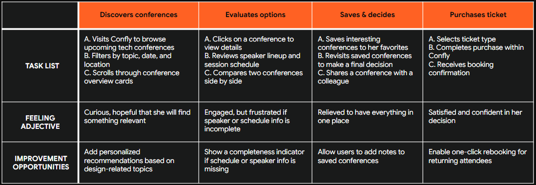
Sarah Chen

Age: 31
Education: Bachelor's in Graphic Design
Hometown: London, United Kingdom (originally from Hong Kong)
Family: Lives with her partner, no children
Occupation: Senior UX/UI Designer at a mid-sized product agency
"I want to keep growing in my field, but finding the right conferences to attend feels like a part-time job in itself."
Goals
Stay up to date with the latest trends in design and technology by attending relevant conferences each year
Find conferences that offer a strong lineup of speakers and workshops, not just keynotes
Plan and book conference attendance efficiently without it taking up too much of her workday
Frustrations
Spends too much time jumping between websites to find conferences that match her interests and schedule
Conference websites are inconsistent in how they present information — speaker lineups and session details are often incomplete or hard to find
Has missed early bird ticket prices because she lost track of conferences she wanted to attend
Story
Sarah is passionate about her craft and sees conferences as an important part of her professional development. She aims to attend two or three events each year, combining large international conferences with smaller local ones. However, finding the right events takes longer than expected. She starts with a search or listing platform but quickly ends up with many tabs open across different websites. Each site presents information differently, making it difficult to compare options and keep track of the events she is considering.
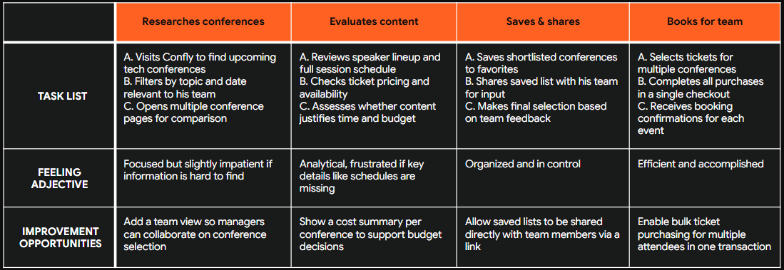
Marcus Okafor

Age: 44
Education: Master's in Computer Science
Hometown: Berlin, Germany (originally from Nigeria)
Family: Married, three children
Occupation: Engineering Manager at a large software company
"I need my team to be sharp and current. Conferences are one of the best ways to make that happen, but organizing it is always a hassle."
Goals
Find relevant tech conferences for himself and his team to attend throughout the year
Quickly evaluate whether a conference is worth the time and budget investment based on speakers and content
Streamline the process of booking tickets for multiple team members across different events
Frustrations
Comparing conferences across different websites is time-consuming because information is presented inconsistently.
Purchasing tickets for multiple conferences requires going through separate payment flows on different platforms, which is inefficient when booking for a team
Has no reliable way to save and share interesting conferences with his team before making a final decision
Story
Bernard works long shifts and values his weekends with family. He usually does the weekly grocery run on Saturday mornings. While he typically shops at his local supermarket, he sometimes visits a larger branch for specific Ghanaian ingredients. These trips are frustrating because the layout is unfamiliar and signage is unclear, causing him to search the entire store or leave without items. He wishes he could simply search for a product and know exactly where to go.
04. How might we
How might we 01
How might we allow users to browse and compare tech conferences without ever having to leave the platform?
Based on painpoint 01: Existing platforms redirect users to individual conference websites
How might we 02
How might we present conference information in a consistent and complete way, so users can easily evaluate whether an event is worth attending?
Based on painpoint 02: Comparing conferences is difficult due to inconsistent information structures
How might we 03
How might we give users a way to save and organize conferences they are interested in, so they never lose track of an event?
Based on painpoint 03: Saving conferences of interest is not possible across redirects
How might we 04
How might we allow users to purchase tickets for multiple conferences in a single, streamlined transaction?
Based on painpoint 04: Purchasing tickets for multiple conferences requires separate transactions
05. User story & journey

User story
“As a designer who wants to stay current in her field, I want to browse and compare tech conferences in one place, so that I can quickly find and book events that match my interests without spending hours across multiple websites.”

User story
“As an engineering manager responsible for my team's development, I want to evaluate and book tickets for multiple conferences in one place, so that I can efficiently organize conference attendance for my team without going through separate platforms.”
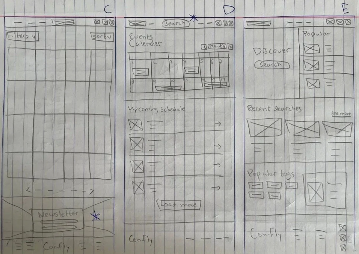
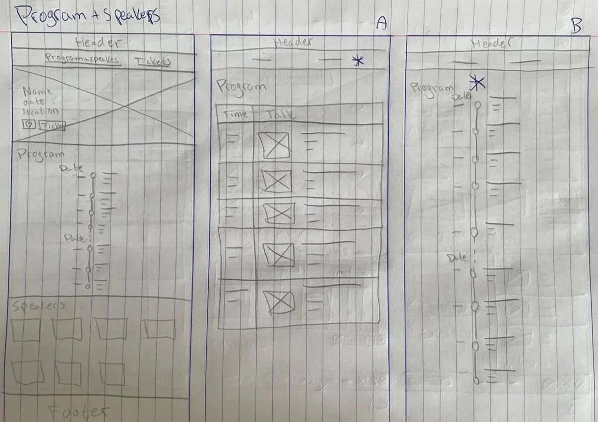
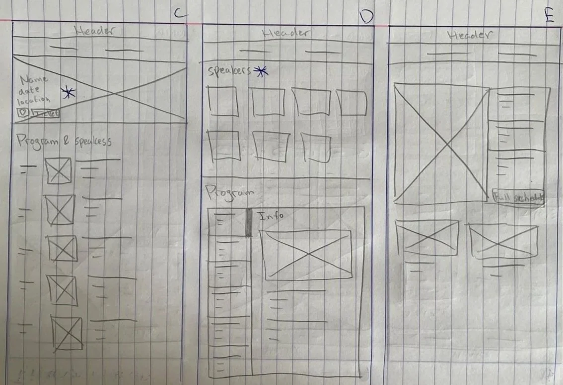
06. Paper Wireframes
Method
For each screen, I sketched five variations and combined the strongest elements into a single wireframe. Shown below are 2 examples of this method for the homepage and program & speakers page.
Homepage
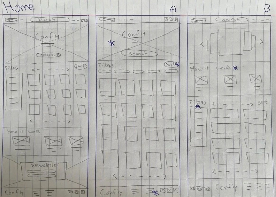
Program & speakers page
07. Lo-fi prototype
Method
The paper wireframes were transformed into digital wireframes using Figma. 4 examples of the first iteration of low-fidifelity prorotype are shown below.
Homepage
Program & speaker page
Ticket page
Shopping cart page
08. Lo-fi usability study & improvements
Low-fidelity usability study
Method: Unmoderated usability study (survey)
Participants: 9
Session duration: 5-15 minutes
Research questions:
What can we learn from the user flow, or the steps that users take to find a conference and purchase a ticket?
Are there parts of the user flow where users get stuck?
Are there more features that users would like to see included on the website?
Do users think the website is easy or difficult to use?
Tasks
Nine participants took part in an unmoderated usability study in which they were asked to complete three core tasks: browsing conferences and viewing program and speaker information, adding tickets to the shopping cart and navigating to the cart, and completing the checkout process. All three tasks were rated positively by the majority of participants. Browsing conferences and adding tickets to the cart were both rated as easy or very easy by 100% of participants. The checkout process received slightly more mixed results, with 88% of participants rating it as easy or very easy and one participant rating it as neutral. One participant who reported difficulty across all tasks was excluded from the quantitative results, as their issues were caused by unfamiliarity with Figma rather than the design itself
Affinity diagram
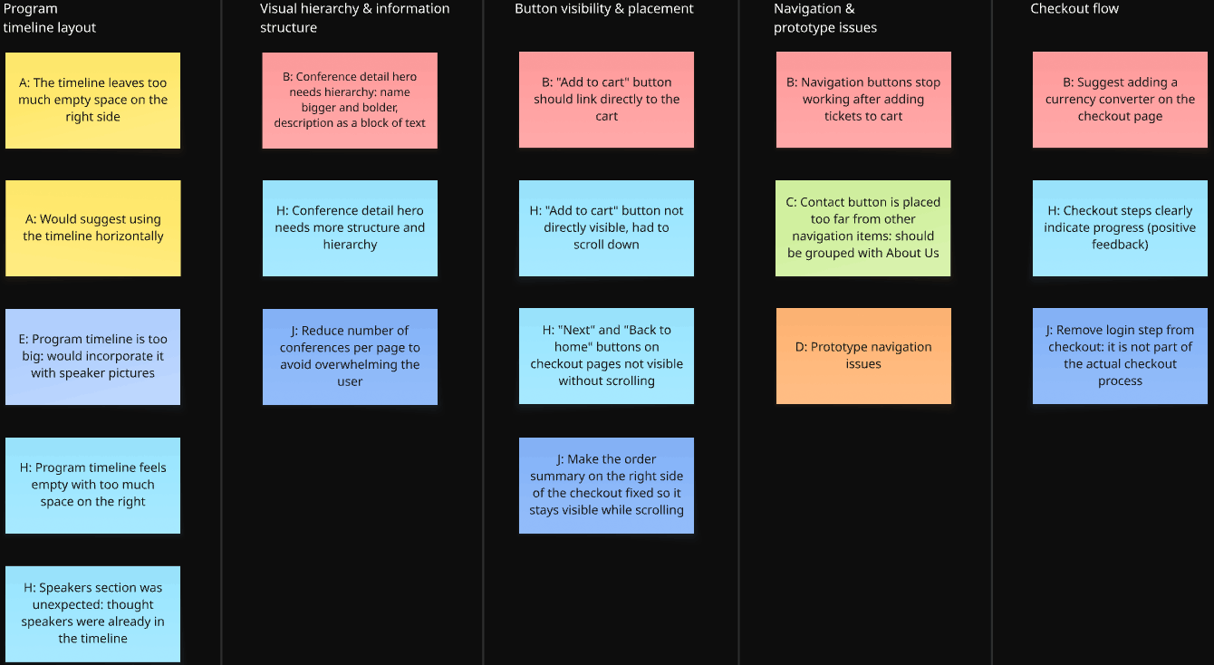
Actionable insights & Improvements
Insight 01: The conference detail page lacks visual hierarchy in the hero section
Users noted that the conference name, date, location, and description are presented without clear hierarchy, making it hard to quickly scan the most important information at the top of the page.
Action: Users need a clear visual hierarchy on the conference detail page, with the conference name prominent and supporting details structured below it.
Insight 02: The program timeline lacks visual balance, leaving too much empty space
Multiple participants noted that the program timeline feels too large and sparse, with significant empty space on the right side. This makes the page feel unfinished and reduces readability.
Action: Users need a more compact and visually balanced timeline, either by reducing whitespace or by incorporating speaker information directly into the timeline.
Improvements
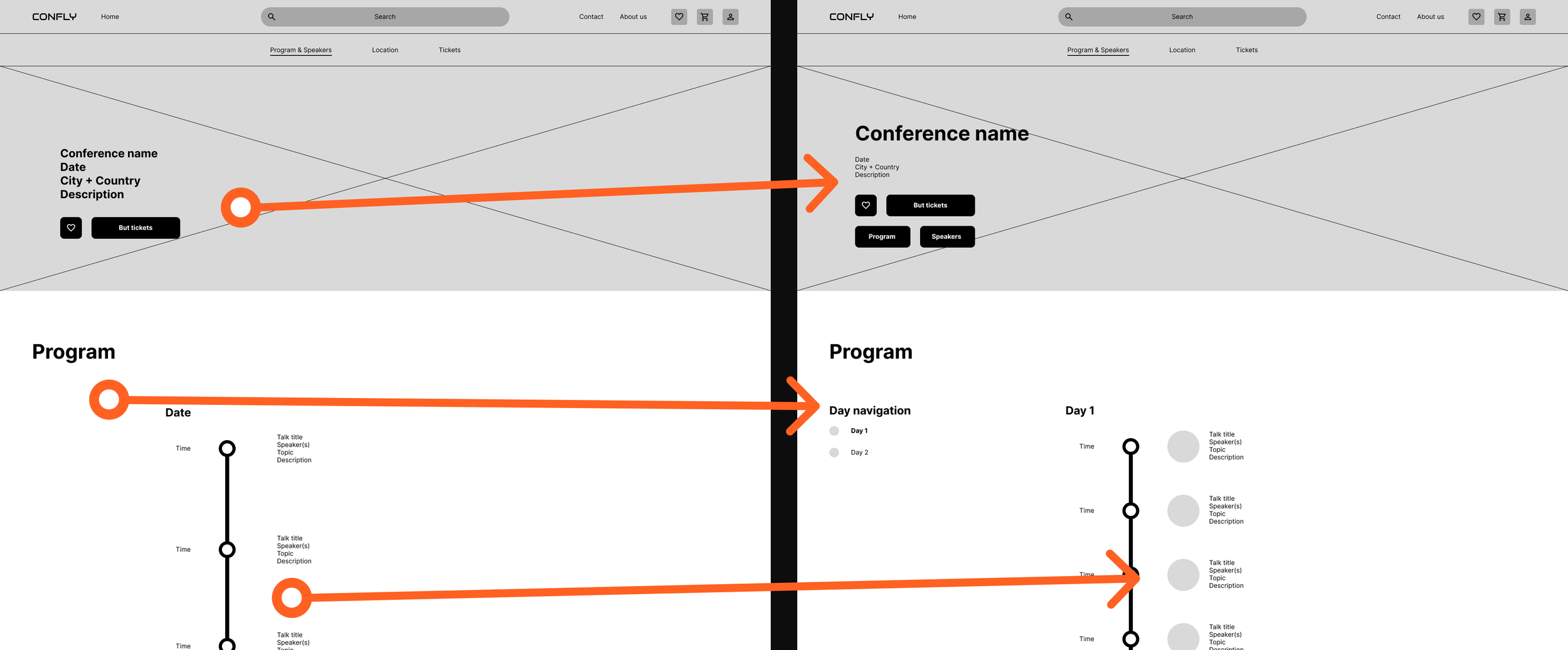
The information in the hero section was reorganized to create a clearer visual hierarchy. Two buttons, “Program” and “Speakers,” were also added to allow users to quickly scroll to the corresponding sections, making it more obvious that these are distinct parts of the page.
Additionally, a sticky day navigation was introduced to make switching between program days easier. The timeline was refined by reducing spacing between talks and adding speaker photos to each session, improving readability and making the schedule easier to scan. These changes also reduce empty space.
Insight 03: Key buttons are not visible without scrolling
Multiple participants could not immediately see the "Add to cart" button on the tickets page, and the "Next" and "Back to home" buttons on the checkout pages, because they fell below the visible screen area.
Action: Users need all primary call-to-action buttons to be visible without scrolling, either by repositioning them or by making the layout more compact.
Improvements
In the original design, some buttons were only immediately visible when the website was viewed in a full-screen desktop window. However, most users do not browse in full screen. To address this, the layouts of the affected pages were adjusted vertically so that these buttons remain visible even when the browser is not maximized.
09. Hi-fi prototype
Based on the lo-fi usability study insights, the designs were refined into a high-fidelity prototype. Color, typography, and real product imagery were introduced to create a realistic representation of the final product.
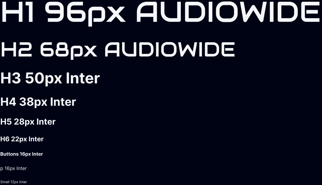
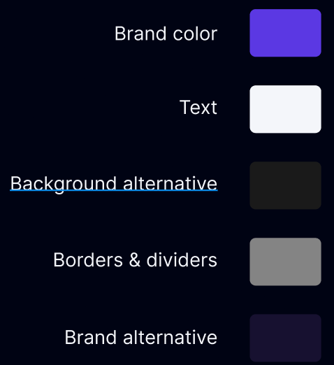
Design system
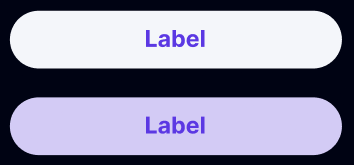
To maintain consistency and speed up the design process, a design system was created as the foundation for the high-fidelity prototype. The system covers, among other things, typography, colors, icons, and buttons, ensuring every screen follows the same visual language.
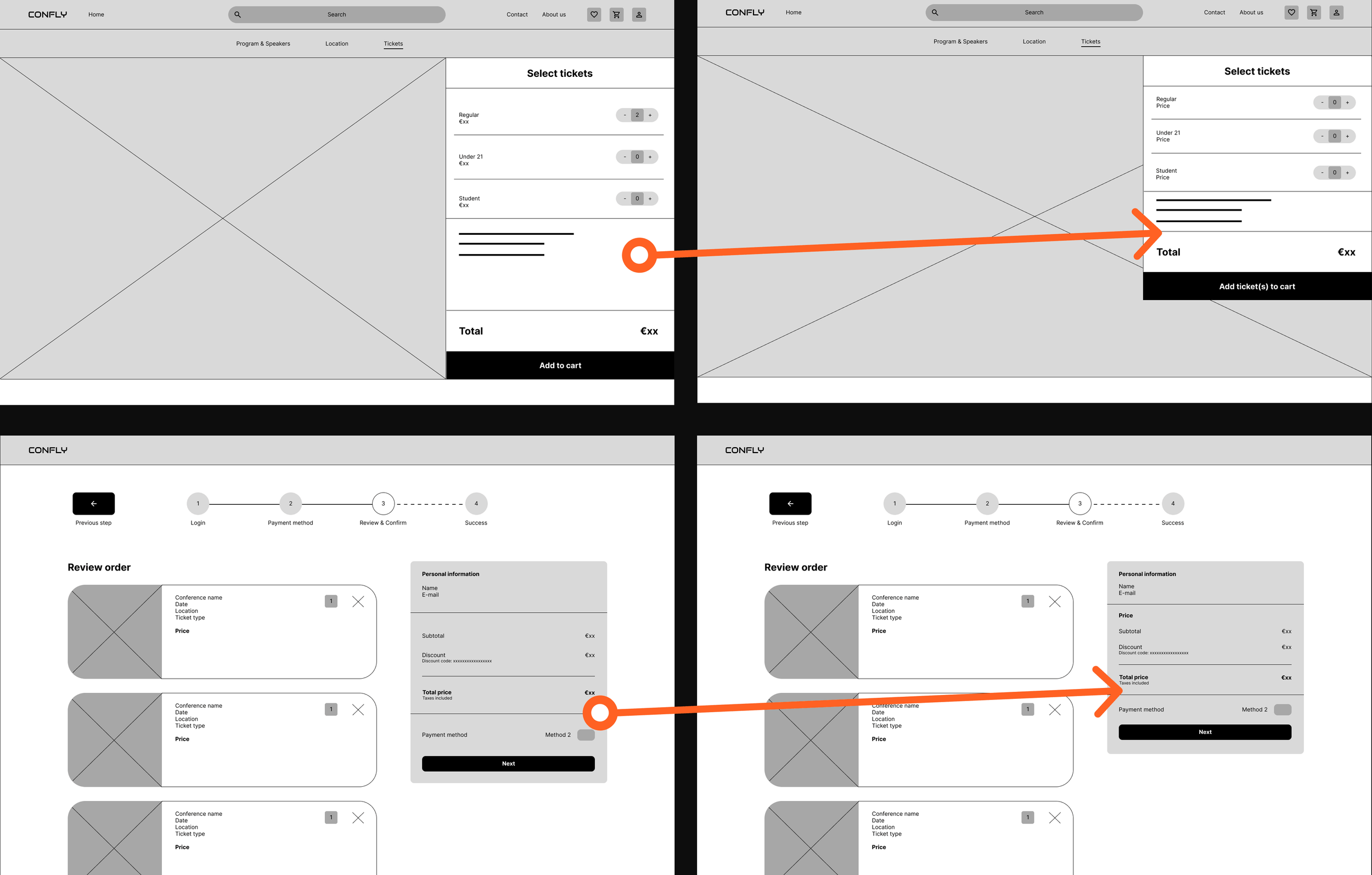
The high-fidelity mockups below illustrate the main user flow, from the homepage to successfully completing the checkout process. Each screen reflects the design decisions and improvements made following the lo-fi usability study. Not all pages are fully shown, as they are too long.
Homepage
Program & speakers page pt.1
Program & speakers page pt.2
Tickets page
Shopping cart page
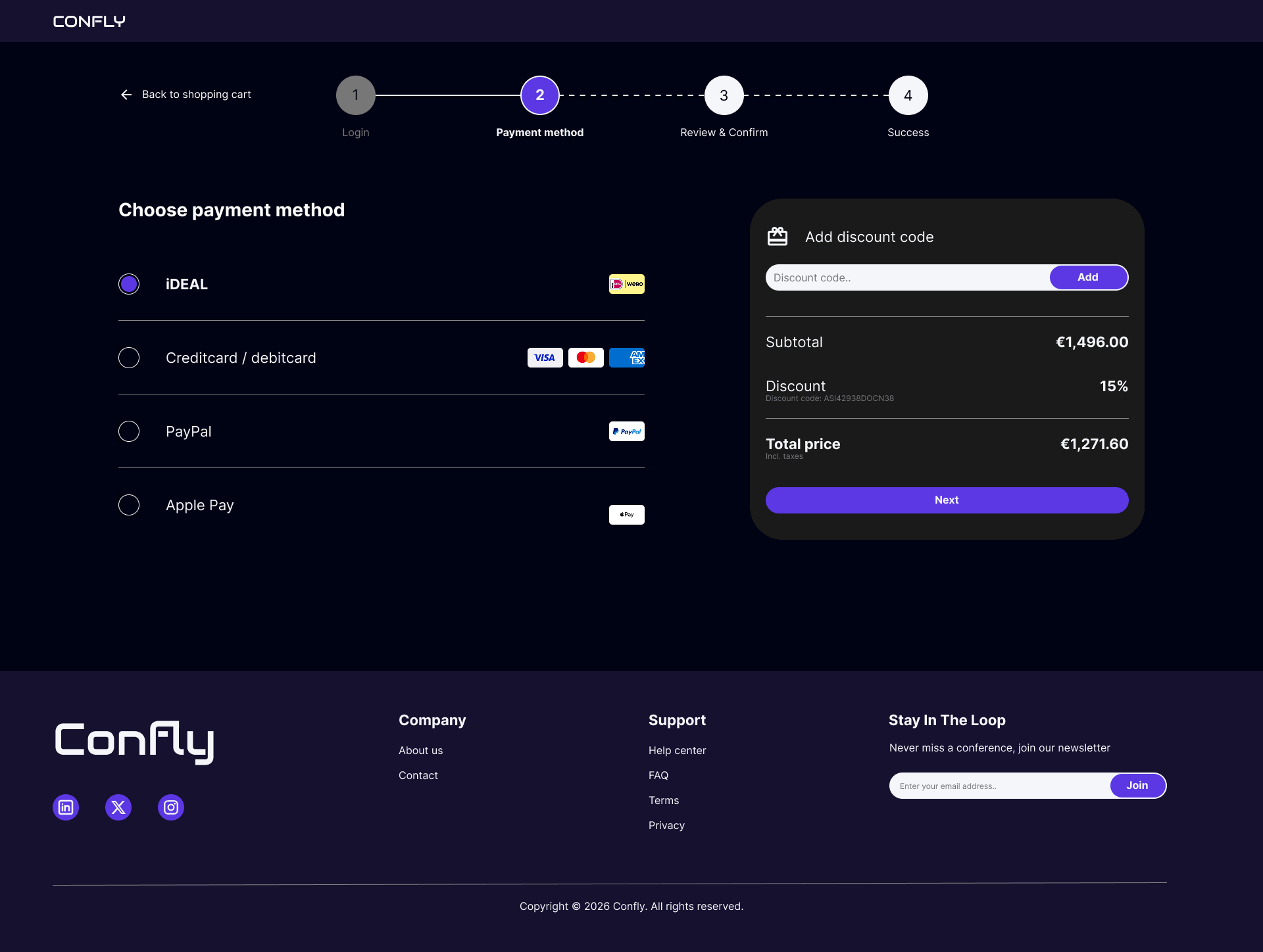
Payment method page
review & order page
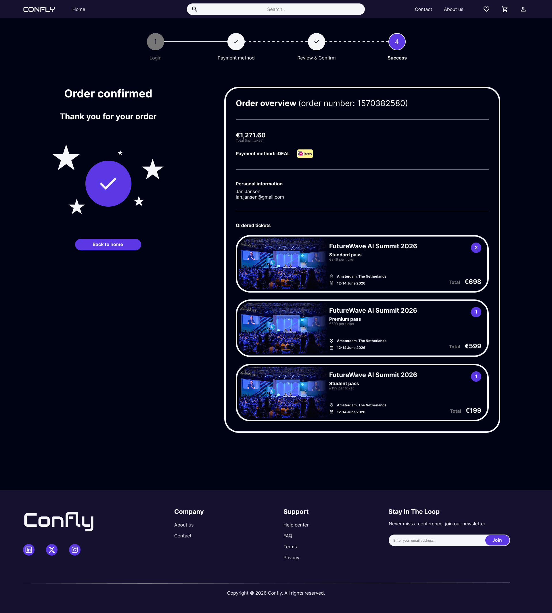
success page
10. hi-fi usability study & improvements
High-fidelity usability study
Method: Unmoderated usability study (survey)
Participants: 7
Session duration: 5-15 minutes
Research questions:
What can we learn from the user flow, or the steps that users take to find a conference and purchase a ticket?
Are there parts of the user flow where users get stuck?
Are there more features that users would like to see included on the website?
Do users think the website is easy or difficult to use?
Tasks
Seven participants took part in an unmoderated usability study in which they were asked to complete four core tasks: browsing conferences and saving favorites, viewing program and speaker information, adding tickets to the shopping cart, and completing the full checkout process. The study measured ease of use across nine specific interactions within these tasks.
Browsing and saving conferences performed strongly, with conference card information rated as easy or very easy by 100% of participants, and the favorite button rated positively by 86% of participants. Program and speaker information was equally well received, with the speaker cards rated as easy or very easy by 100% of participants and the program timeline rated positively by 86% of participants.
The ticket purchasing flow showed more variation. Adding tickets to the cart was rated as easy or very easy by 71% of participants, with one participant rating it as very difficult. Navigating to the shopping cart was rated positively by 71% of participants, with two participants rating it as neutral. Choosing a payment method was rated as easy or very easy by 71% of participants, with one participant rating it as difficult.
The checkout process itself performed well overall. Reviewing and confirming the order was rated as easy or very easy by 100% of participants, and navigating between checkout steps was rated positively by 100% of participants.
Affinity diagram
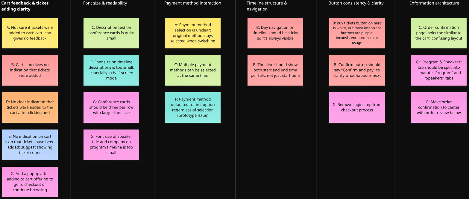
Actionable insights & Improvements
Insight 01: Users receive no clear feedback when tickets are added to the cart
Multiple participants were unsure whether their tickets had been successfully added to the cart because the cart icon showed no visual change after the action. This created uncertainty and caused some users to attempt adding tickets multiple times.
Action: Users need a clear visual confirmation when tickets are added to the cart, such as a badge or counter on the cart icon, or a popup offering to continue browsing or proceed to checkout.
Improvements
o make it clearer to users that tickets have been successfully added to the cart, two visual feedback mechanisms were introduced. First, a popup slides in from the side of the screen to notify the user that tickets have been added to their shopping cart. Second, the 'Add ticket(s) to cart' button temporarily changes from purple to white and updates its label to 'Ticket(s) added to cart' for a few seconds after clicking. Together, these two changes ensure users receive clear and immediate confirmation that their action was successful.
Insight 02: Font sizes on the conference cards are too small to read comfortably
Participants noted that the text on the conference cards, including the conference description and details, is too small to read easily.
Action: Users need larger, more legible font sizes on the conference cards to ensure readability.
Improvements
The conference cards were redesigned to improve readability and visual consistency. The conference image was increased in size, and the font sizes for the conference description and details were enlarged to make the information easier to read at a glance.
As part of this redesign, the card border style was updated across the entire website, replacing the thicker white border with a thinner grey border. This change was applied consistently to all card elements, including the speaker cards and the shopping cart item cards, resulting in a cleaner and more cohesive visual style.
Insight 03: Font sizes on the program timeline are too small to read comfortably
Several participants noted that the text on the program timeline, including session descriptions, speaker titles, and company names, is too small to read comfortably, particularly when using the website in a smaller browser window or at a lower zoom level.
Action: Users need larger, more legible font sizes on the program timeline to ensure readability across different screen sizes and browser configurations.
Insight 04: The program timeline lacks structure for multi-day events
Participants noted that the day navigation on the timeline is not sticky, making it easy to lose track of which day is being viewed while scrolling. Additionally, only the start time of each session is shown, leaving users without a clear sense of how long each session lasts.
Action: Users need a sticky day navigation on the timeline and a clear indication of both the start and end time per session.
Improvements
Font sizes across the program timeline were increased to improve readability and visual hierarchy. Body text was increased from 12px to 16px, and heading text was increased from 16px to 22px. Not only does this make the text more readable, it also creates better hierarchy. The difference in font size is now 6px instead of 4px, making the distinction between text styles clearer. Additionally, the speaker profile pictures on the timeline were increased in size to improve clarity.
A fully functioning sticky day navigation menu was too complex to implement. However, this feature could be noted as a recommendation for developers to implement in a future iteration. Additionally, session times were updated to display both a start and end time, rather than only the start time.
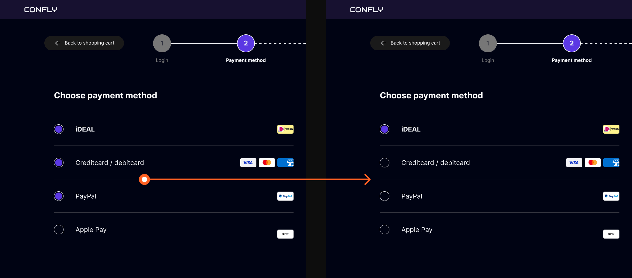
Insight 05: The payment method interaction is unclear and allows multiple selections
Multiple participants noticed that selecting a new payment method did not deselect the previous one, making it possible to have multiple payment methods selected simultaneously. This created confusion about which method would actually be used for the transaction.
Action: Users need a clear and mutually exclusive payment method selection, where choosing one option automatically deselects any previously selected method.
Improvements
The payment method selection was updated so that only one option can be selected at a time. Previously, multiple payment methods could be selected simultaneously, causing confusion about which method would be used for the transaction. This was resolved by rebuilding the component with mutually exclusive variants, ensuring that selecting a new payment method automatically deselects the previous one.
11. Learnings
What went well?
Looking back on this project, I am proud of what I was able to create. Working through the full design process and seeing it come together into a cohesive end result felt like a significant achievement.
I am particularly proud of the usability studies. With nine participants in the lo-fi study and seven in the hi-fi study, both rounds exceeded the commonly recommended minimum of five participants, resulting in a diverse range of feedback that gave me clear directions for improvement. The insights gathered from both studies directly shaped the final design, which made the iterative process feel meaningful and grounded.
This was also my first dark themed design, which came with its own set of challenges, like choosing the right color contrasts to maintaining readability across the website. It was a valuable learning experience that pushed me to think more carefully about visual design decisions than I had before.
What would i do differently?
There are a few things I would approach differently if I were to do this project again. The most significant is the absence of real user research at the start of the process. Because this project originated from a predefined course brief, conducting prior user research was not a natural starting point. However, in a professional context, I would always begin by speaking to real users before defining pain points or creating personas, rather than relying on assumption-based proto-personas as I did here.
I would also have spent more time on the information architecture of the website before moving into wireframes. Some of the structural decisions, like the placement of navigation items and the checkout flow, required adjustments during the usability studies that could have been identified earlier with a more thorough planning phase.
Finally, some prototype interactions, like the payment method selection, were not fully functional during testing, which affected the experience of some participants. In a future project, I would invest more time in making the prototype as realistic as possible before conducting usability studies, to ensure that participant feedback reflects the actual design rather than prototype limitations.
Next steps
If this project were to continue, the most important next step would be to validate the assumptions that currently underlie the personas and pain points. This would mean conducting real user interviews with tech enthusiasts and professionals to confirm whether the identified pain points accurately reflect their experiences, and refining the personas based on actual data rather than assumptions.
Additionally, expanding the platform with a personal dashboard where users can manage their upcoming conferences, saved favorites, and past orders would be a logical next step, making Confly not just a discovery and booking platform, but a tool users return to throughout the conference season.
Finally, if the website were to move towards development, designing for additional screen sizes, such as tablet and mobile, would be a logical next step, ensuring the experience remains consistent across devices.