Product Finder
Where
Amsterdam, The Netherlands
What
Mobile App
Why
Google UX Design Course, Portfolio Project
Role
Designer, Researcher
When
Nov. 2025 - Jan. 2026
QUICK OVERVIEW
01. The Problem
Supermarket shoppers waste time searching for products and leave the store frustrated without having found everything.
02. The Solution
An in-app product finder that provides visitors with a route past all the products they need.
03. The Design of the Most important screens
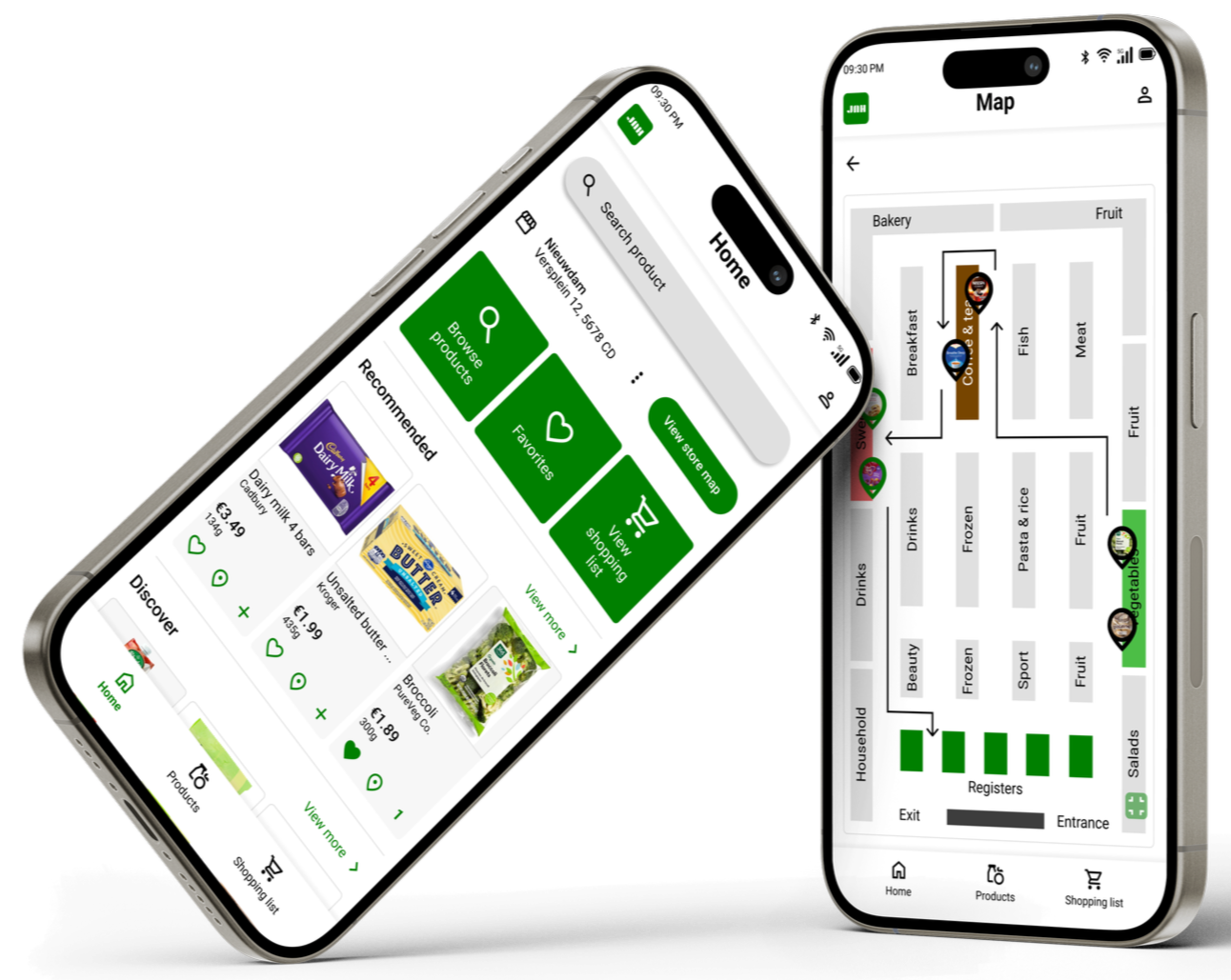
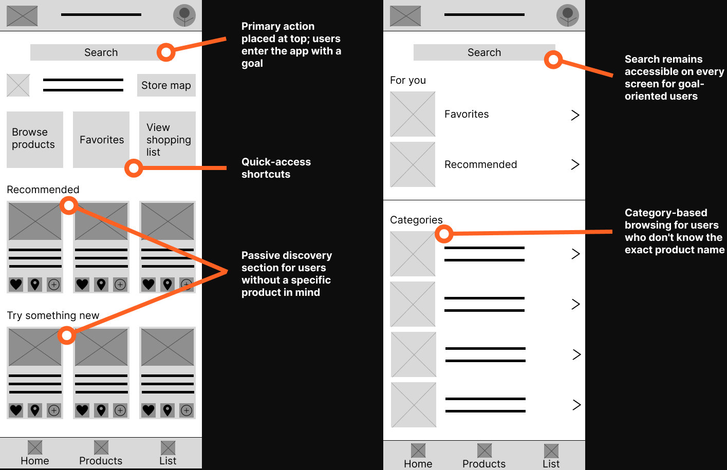
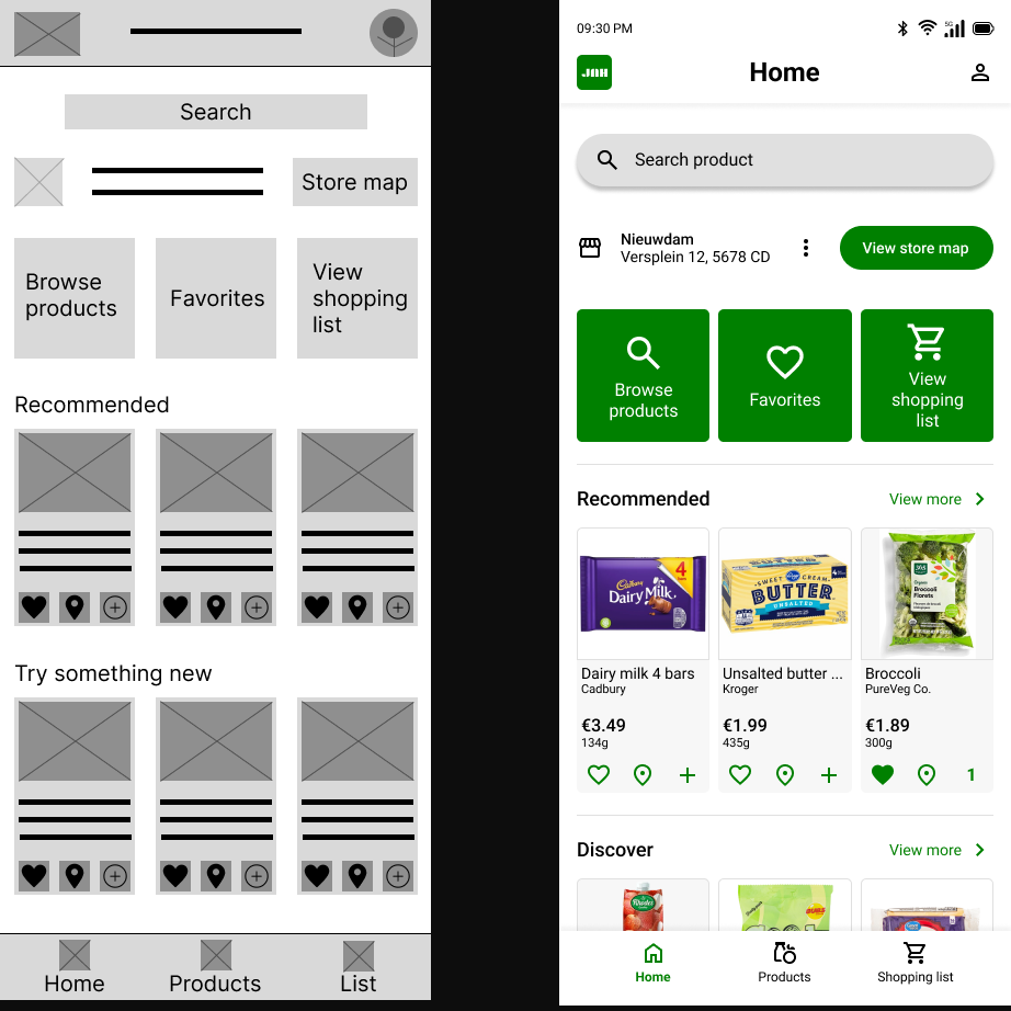
A. Homepage
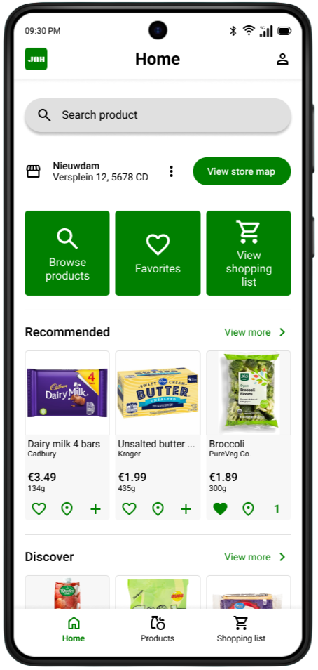
The search bar is deliberately placed at the top as a primary action: users enter the app with a purpose.
Browse, Favorites and Shopping list shortcuts provide direct access to the most used functions without searching.
B. Store map
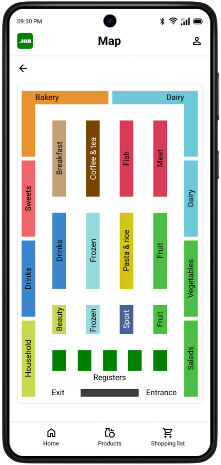
Each department has its own color for quick visual orientation; no need to read text to understand the layout.
The layout mirrors the actual floor plan, minimizing mental mapping for the user.
C. Shopping list
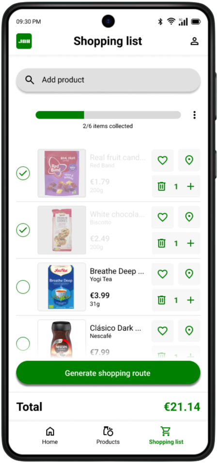
The progress bar gives users an immediate sense of control over how many products they've found.
Checked-off products remain visible instead of disappearing, so users can keep overseeing their full list.
D. Shopping route
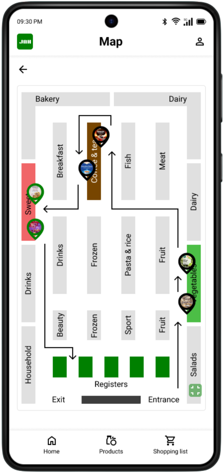
When a user creates a shopping list, the app automatically generates an optimal walking route through the store.
Pins with product images make it instantly clear where each product is located, without reading product names.
Want to go in deep?
Full case study
00. Before we start
This project originated from the Google UX Design course on Coursera, where designing a product finder app for supermarket shoppers was one of the suggested prompts. Because the project brief was predefined, no prior user research was conducted. The painpoints and personas in this case study are therefore assumption-based proto-personas rather than research-validated. However, both rounds of usability testing were conducted with real participants, grounding the design iterations in genuine user feedback.
01. Overview
The project
This project is a grocery store product finder app designed to help shoppers quickly locate items in a physical supermarket. Users can search for products, add them to a shopping list, and generate an efficient in-store route. The app aims to reduce frustration and save time, especially when shopping in unfamiliar stores.
02. Problem statement
The Problem
Customers often struggle to find products in physical supermarkets. This can lead to frustration, longer shopping hours, and a less pleasant shopping experience.
The Goal
The goal of this project is to create a digital solution that allows customers to easily find products in a physical supermarket, resulting in a faster and more enjoyable shopping experience.
03. Painpoints & user personas
01. Time pressure makes grocery shopping stressful
Shoppers with busy schedules experience grocery shopping as a stressful chore rather than a routine task. When they cannot quickly locate products, small inefficiencies add up and turn a 20-minute errand into a frustrating hour-long ordeal.
02. Unfamiliar store layouts cause confusion and wasted time
Supermarket layouts vary between locations and chains, and products are regularly moved or reorganized. Shoppers who visit a store infrequently or for the first time struggle to orient themselves, often walking through the entire store multiple times to find what they need.
03. Managing a shopping list while navigating a store is mentally taxing
Shoppers rely on mental lists, notes apps, or paper lists that are disconnected from the physical store. Switching between a list and the store environment causes them to lose track of items, forget products, or backtrack through aisles they have already visited.
04. No clear way to find specific or unfamiliar products
When shoppers are looking for a specific brand, a less common product, or an item they have never bought before, there is no reliable in-store system to help them. Asking store staff is seen as a last resort, and aisle signs are often too broad to be useful.
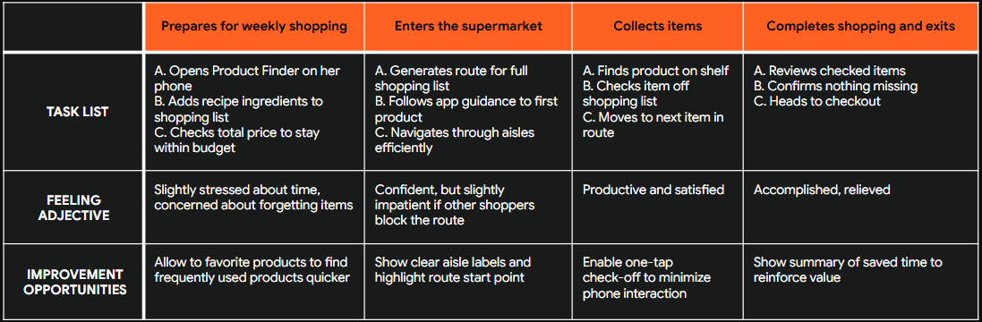
Maya Patel

Age: 22
Education: Bachelor's student in Communication
Hometown: Utrecht, the Netherlands
Family: Lives alone, originally from a British-Indian family
Occupation: Part-time barista (24 hours/week) alongside her studies
"I just want to grab what I need and get out. Every minute I spend wandering around is a minute I don't have."
Goals
Complete her grocery shopping as quickly and efficiently as possible
Plan her meals for the week without spending too much time or money in the store
Find specific products without having to ask for help
Frustrations
Wastes time walking back and forth through the store because she cannot find products quickly
Her go-to supermarket regularly rearranges its layout, making even familiar shopping trips feel confusing
Juggling a grocery list on her phone while trying to navigate the store feels disorganized and causes her to forget items
Story
Maya has a packed schedule between lectures, café shifts, and maintaining a social life. She does her groceries once a week, usually on Wednesday evenings, and tries to get in and out quickly. Shopping under time pressure makes the experience stressful, especially when she has to constantly check her list while navigating the store. She often loses track of items, forgets things, or backtracks through aisles, turning what should be a quick trip into a frustrating task.
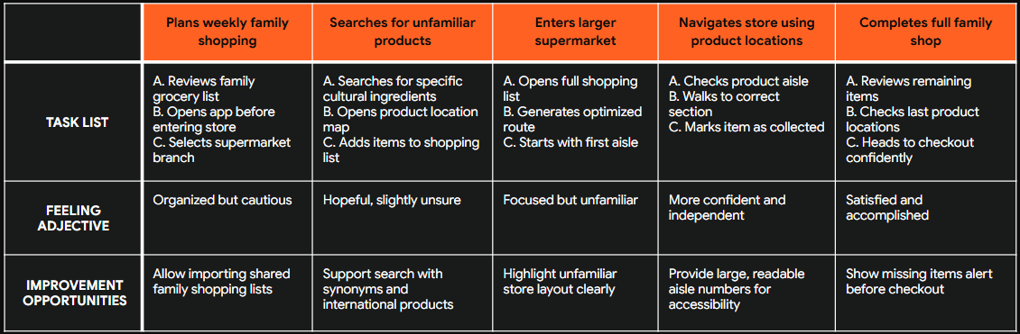
Bernard Osei

Age: 47
Education: Vocational degree in logistics management
Hometown: Amsterdam, the Netherlands (originally from Ghana)
Family: Married, two children aged 12 and 15
Occupation: Warehouse team lead at a distribution company
"I want to enjoy shopping for my family, but when I cannot find what I need I just feel lost and give up."
Goals
Do the weekly family shop efficiently so he can spend his free time with his family
Find products that match his family's dietary preferences, including specific international or cultural products
Feel confident navigating any supermarket, even one he does not visit regularly
Frustrations
When he visits a different supermarket branch or a new store, he struggles to find his way around and often leaves without everything on his list
Broad aisle signs like "International" or "World cuisine" are not specific enough to help him find what he actually needs
He feels uncomfortable asking staff for help and would prefer an independent way to locate products
Story
Bernard works long shifts and values his weekends with family. He usually does the weekly grocery run on Saturday mornings. While he typically shops at his local supermarket, he sometimes visits a larger branch for specific Ghanaian ingredients. These trips are frustrating because the layout is unfamiliar and signage is unclear, causing him to search the entire store or leave without items. He wishes he could simply search for a product and know exactly where to go.
04. How might we
How might we 01
How might we help time-pressured shoppers complete their grocery run in the most efficient route possible?
Based on painpoint 01: Time pressure makes grocery shopping stressful
How might we 02
How might we make navigating an unfamiliar supermarket feel as easy as shopping in a store you visit every week?
Based on painpoint 02: Unfamiliar store layouts cause confusion and wasted time
How might we 03
How might we reduce the mental effort of managing a shopping list while physically moving through a store?
Based on painpoint 03: Managing a shopping list while navigating a store is mentally taxing
How might we 04
How might we help shoppers locate a specific product quickly, without needing to ask store staff or read every aisle sign?
Based on painpoint 04: No clear way to find specific or unfamiliar products
05. User story & journey

User story
“As a busy student with limited time, I want to quickly find products and create an efficient shopping route, so that I can complete my grocery shopping without wasting time searching through the store.”

User story
“As a parent doing weekly family groceries in different supermarkets, I want to search for specific products and see exactly where they are located, so that I can shop confidently and avoid walking through the entire store.”
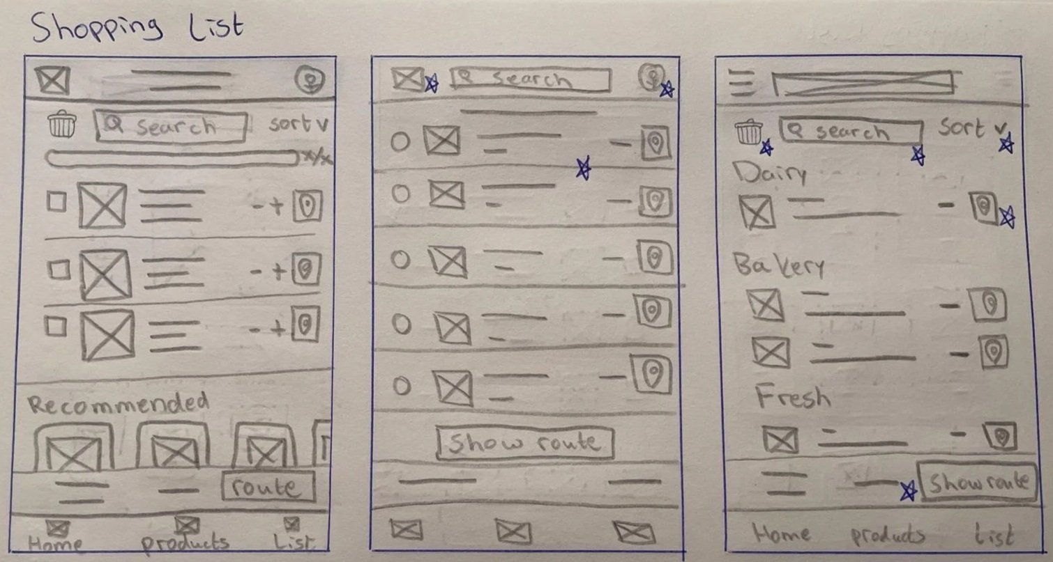
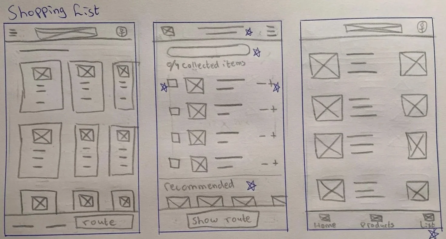
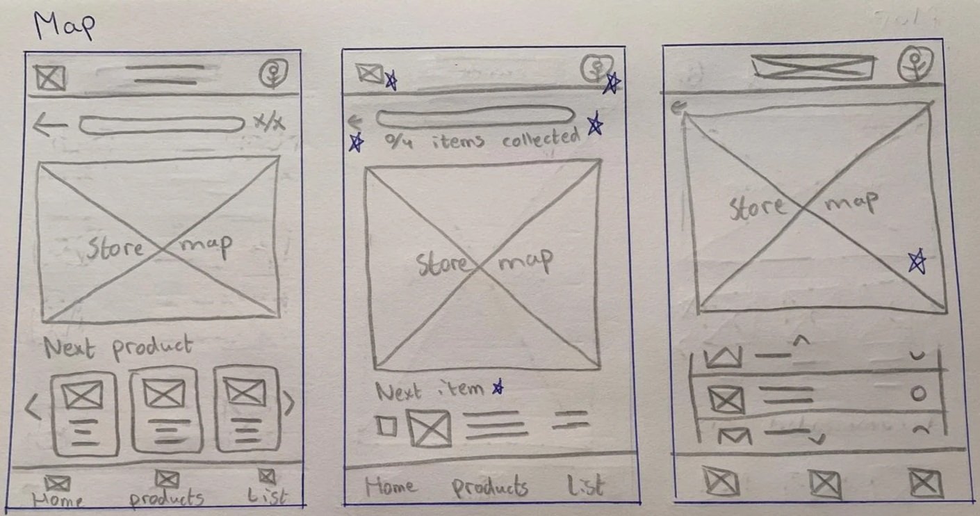
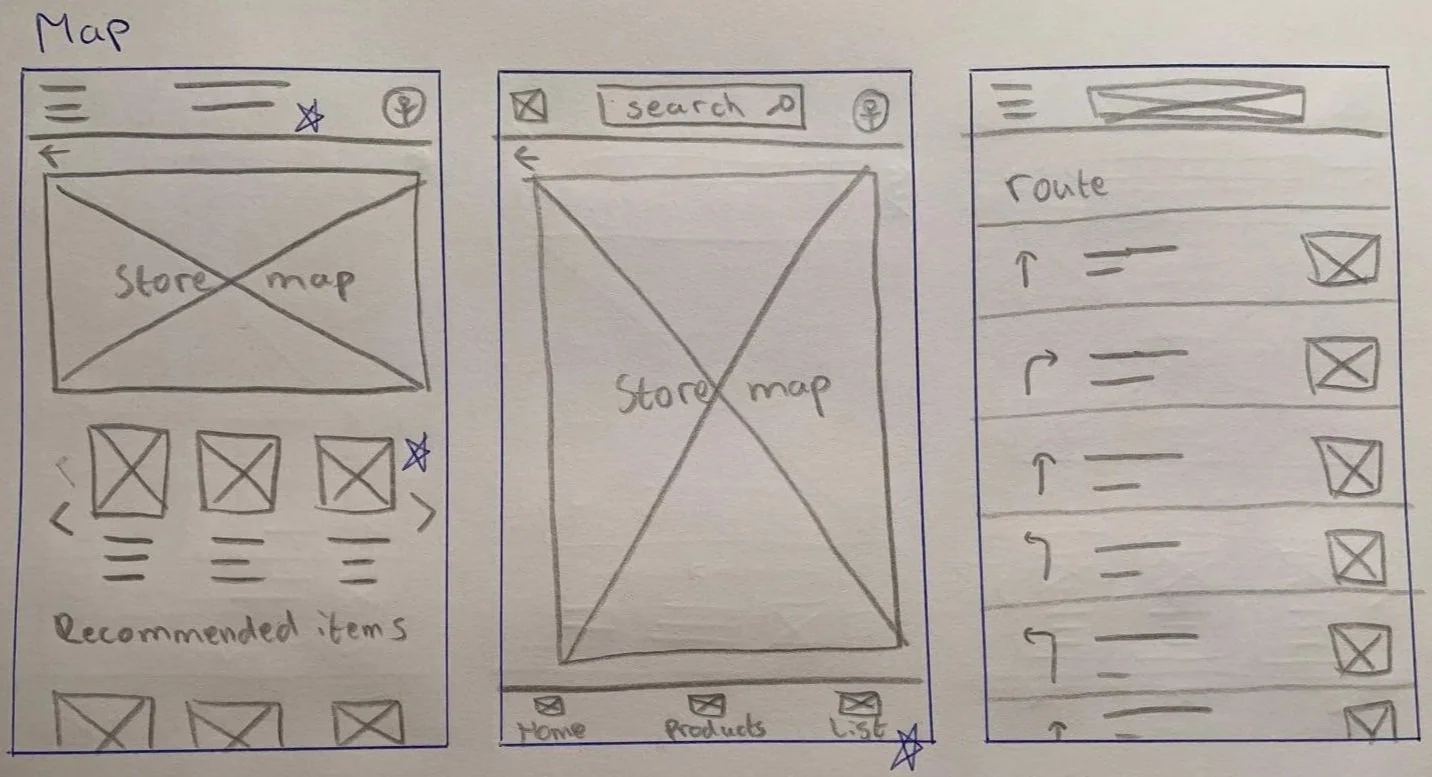
06. Paper Wireframes
Method
For each screen I sketched five variations and combined the strongest elements into a single wireframe. Shown below are 2 examples of this method for the shopping list and map pages.
Shopping list page
Map page
07. Lo-fi prototype
Method
The paper wireframes were transformed into digital wireframes using Figma.
Homepage & Product search page
Products list page & Product info page
Shopping list page & map page
08. Lo-fi usability study & improvements
Low-fidelity usability study
Method: Moderated usability study
Participants: 3 (2 male, 1 female, ages 25-63)
Session duration: 5-15 minutes
Research questions:
What can we learn from the user flow, or the steps that users take to create an in-store shopping route?
Are there parts of the user flow where users get stuck?
Are there more features that users would like to see included in the app?
Do users think the app is easy or difficult to use?
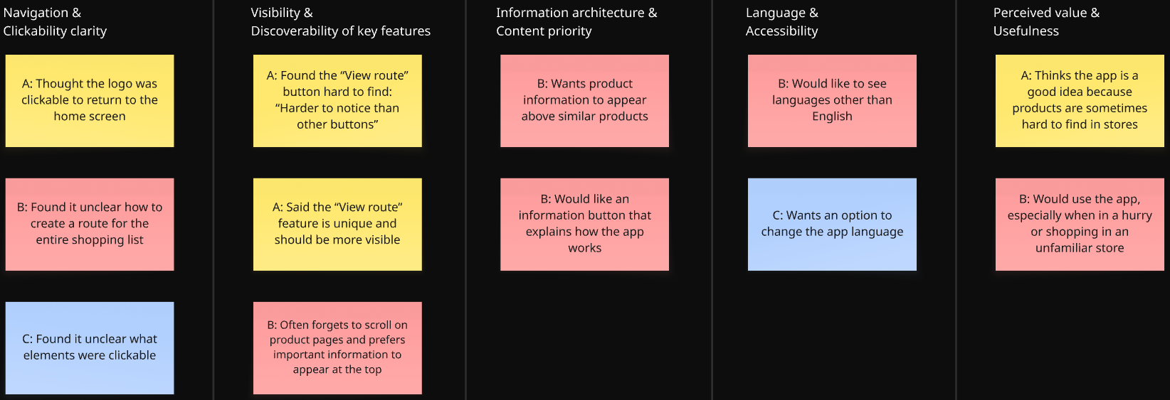
Affinity diagram
Observations from the recorded sessions were organized into an affinity diagram to identify patterns across participants.
Actionable insights & Improvements
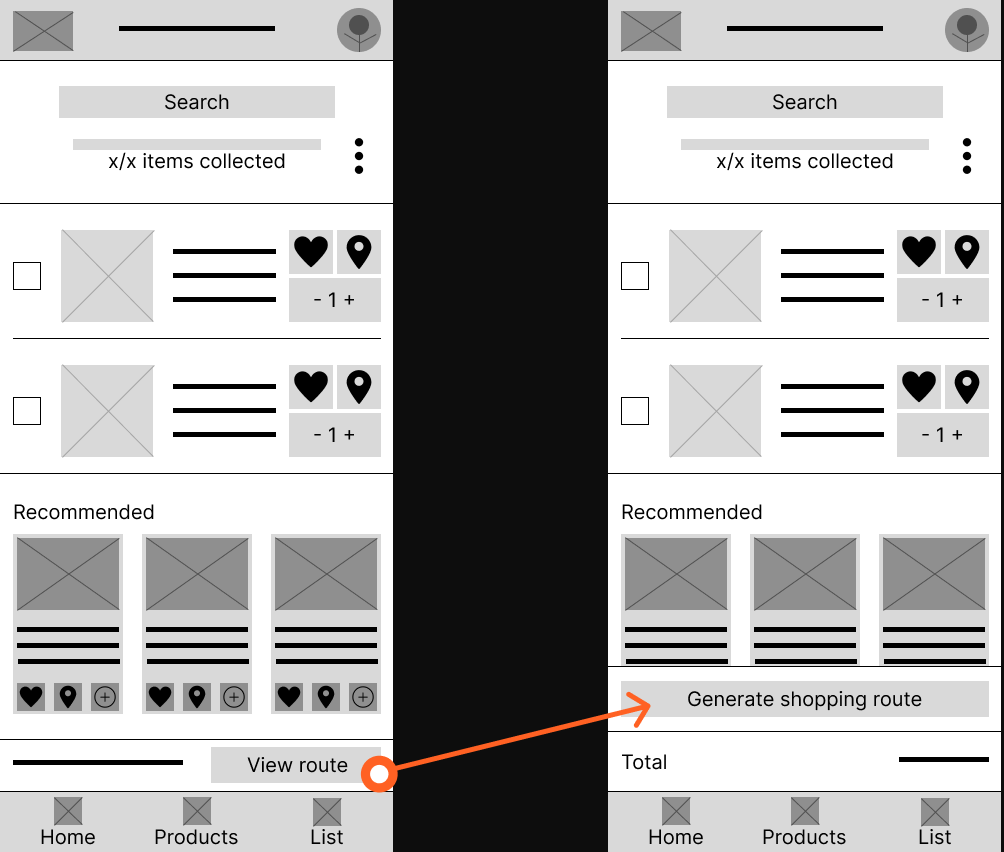
Insight 01: Users get stuck when trying to create or find an in-store route
Users struggle to understand how to generate a shopping route, especially for the entire shopping list, because the “View route” action is not clearly visible or self-explanatory.
Action: Users need a clear and visible way to create an in-store route for their entire shopping list.
Improvements
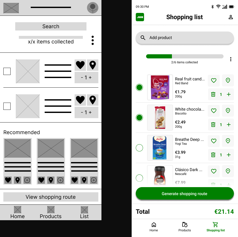
The original “View route” button was small and easy to miss. It was redesigned into a larger sticky “Generate shopping route” button to improve visibility, emphasize the primary action, and better communicate what the feature does.
Insight 02: Key actions are missed when clickable elements are not clearly indicated
Users are unsure what they can interact with in the interface, such as whether the logo is clickable or where to tap to continue.
Action: Users need clearer visual cues to understand which elements are clickable and how to move through the app.
Improvements
Because this is a low-fidelity prototype, it can be difficult to distinguish which elements are clickable, as the design currently uses only grayscale visuals. Therefore, this insight was primarily addressed in the high-fidelity prototype, where clearer visual cues were introduced. Additionally, the logo in the top navigation bar was made clickable in the low-fidelity prototype to improve usability and align with existing app conventions and industry standards.

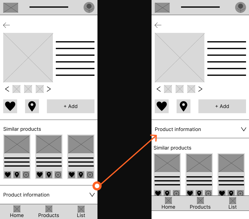
Insight 03: Important information is overlooked when it requires scrolling
Users often miss essential information when it is placed lower on the screen because they do not naturally scroll, especially on product pages.
Action: Users need essential product and navigation information to appear at the top of the screen without requiring scrolling.
Improvements
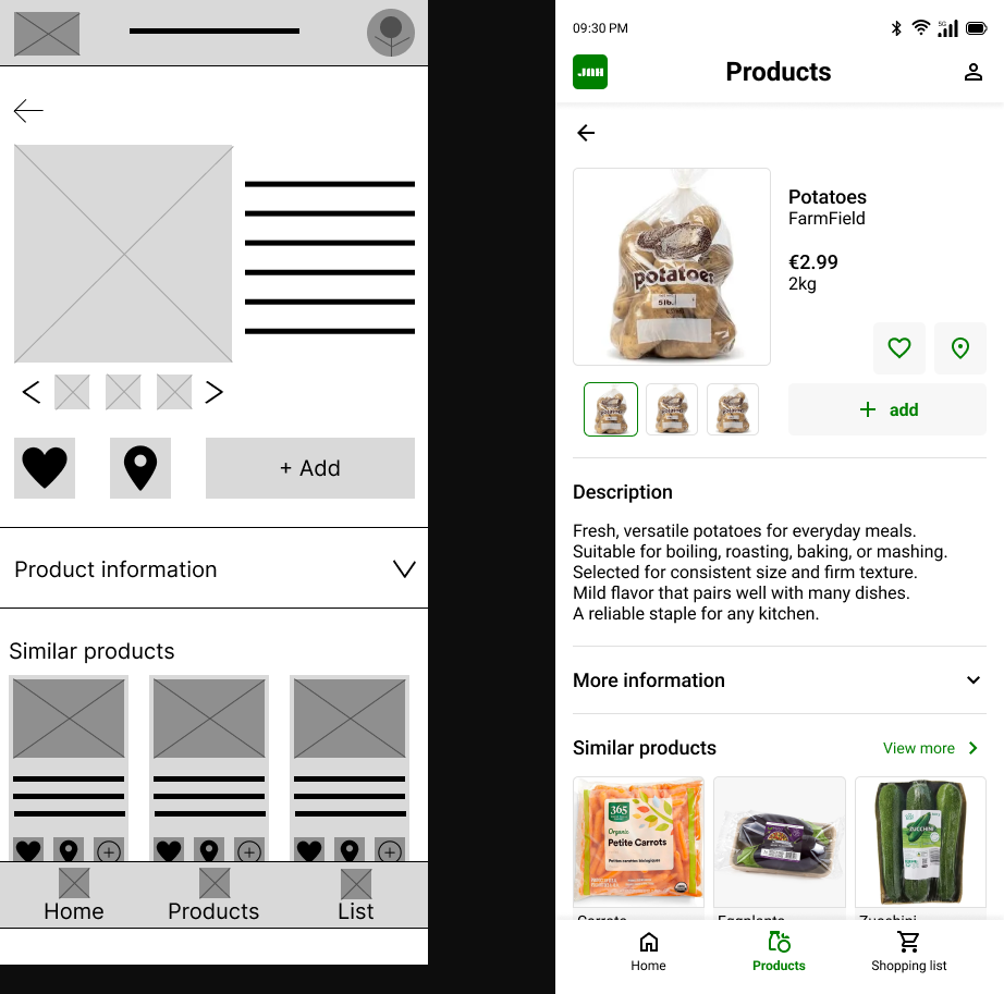
Product information is more important than similar products on the product page. Therefore, the product information section was moved higher on the page so it sits closer to the core product details. The similar products section was moved further down, as it is less directly related to the product itself. This change reduces the need for users to scroll and makes key product information easier to access.
Insight 04: Users want guidance when using the app for the first time
Users expressed a need for in-app guidance, such as an information button or explanation of how the app works, particularly for understanding unique features like in-store routing.
Action: Users need simple in-app guidance to understand how the app works, especially for unique features like in-store navigation.
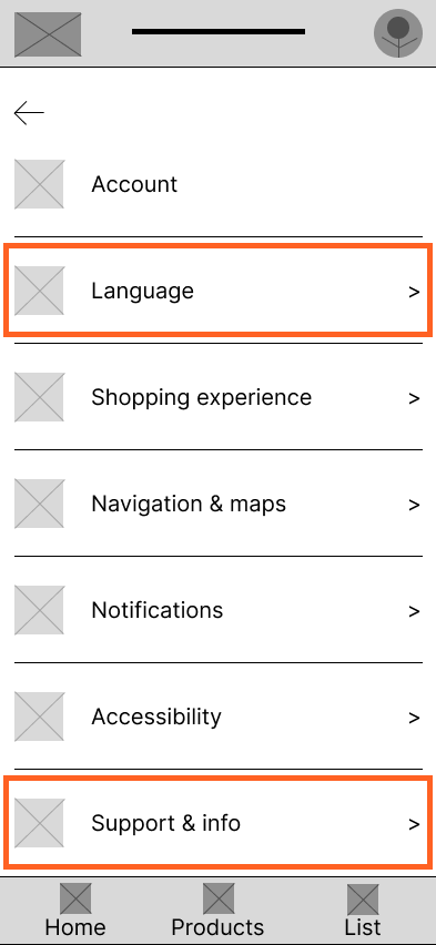
Insight 05: Language options are essential for accessibility and confidence
Users want the ability to change the app language, as language barriers reduce confidence and clarity.
Action: Users need the ability to change the app language to feel confident and comfortable using the app in-store.
Improvements
An account page was introduced, accessible by tapping the profile picture. On this page, users can manage their profile details and adjust app preferences. To address insights 4 and 5, a Language page and a Support & Info page were added. These allow users to change their language preferences and access information about how the app works, making the app more accessible for users.
09. Hi-fi prototype
Based on the lo-fi usability study insights, the designs were refined into a high-fidelity prototype. Color, typography, and real product imagery were introduced to create a realistic representation of the final product.
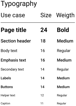
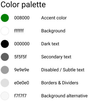
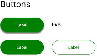
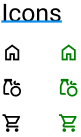
Design system
To maintain consistency and speed up the design process, a design system was created as the foundation for the high-fidelity prototype. The system covers, among other things, typography, colors, icons, and buttons, ensuring every screen follows the same visual language.
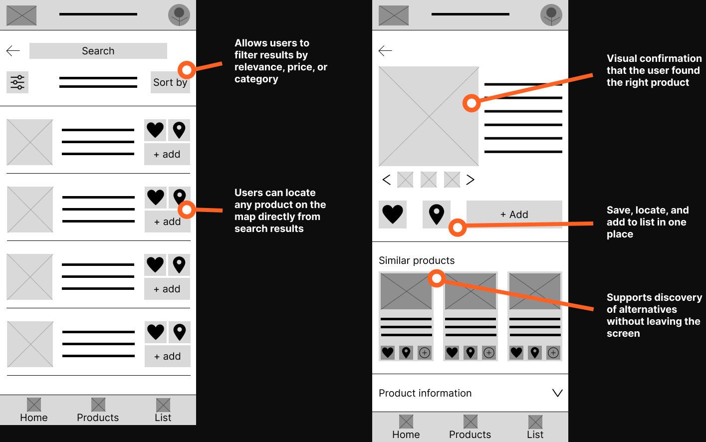
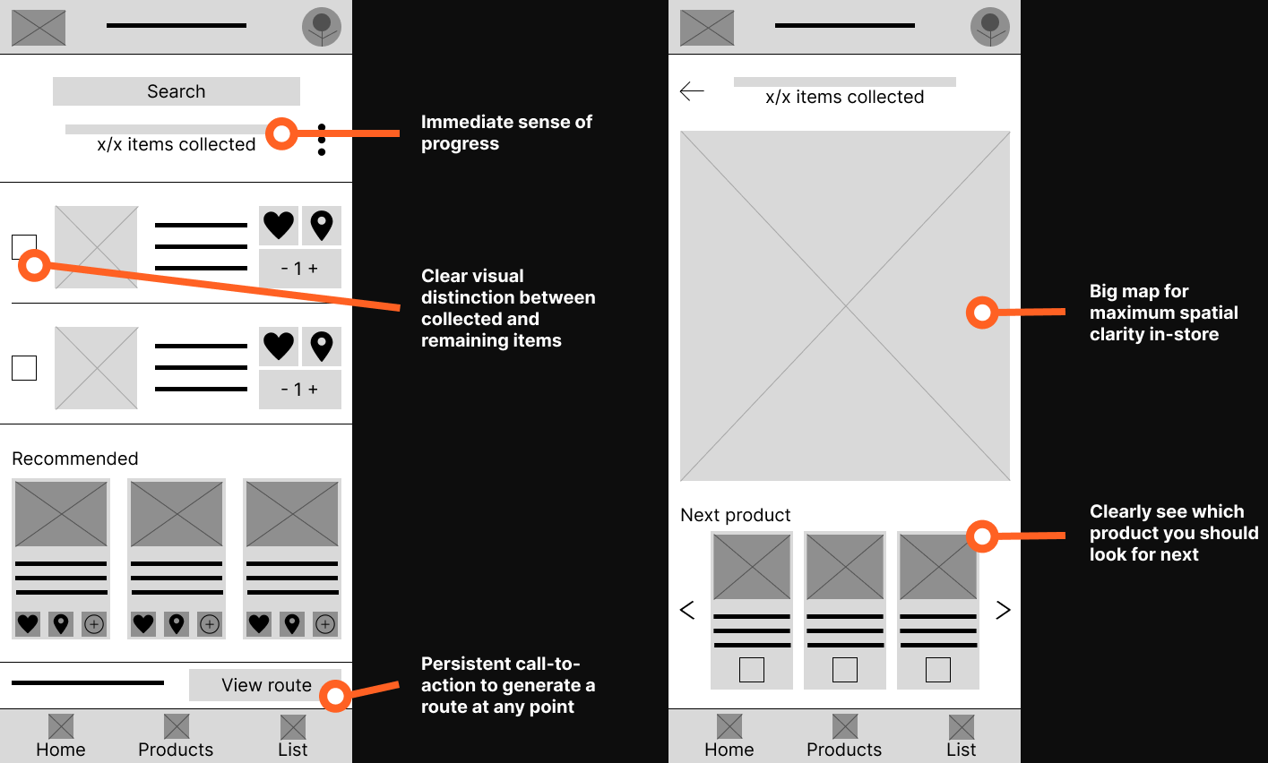
The high-fidelity mockups below illustrate the main user flow, from opening the app on the home screen to generating an optimized in-store shopping route. Each screen reflects the design decisions and improvements made following the lo-fi usability study.
Homepage
Product categories page
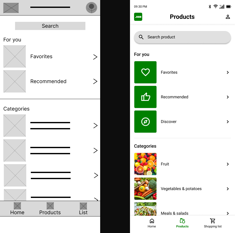
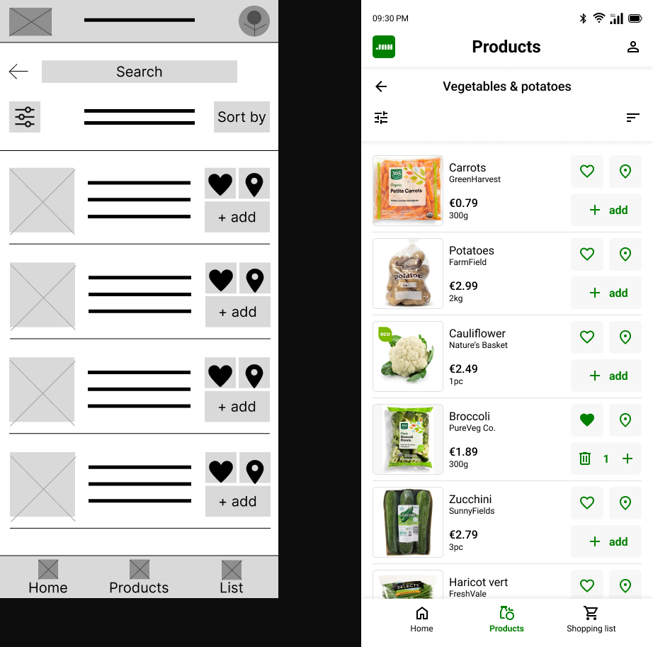
Product list page
Product info page
Shopping list page
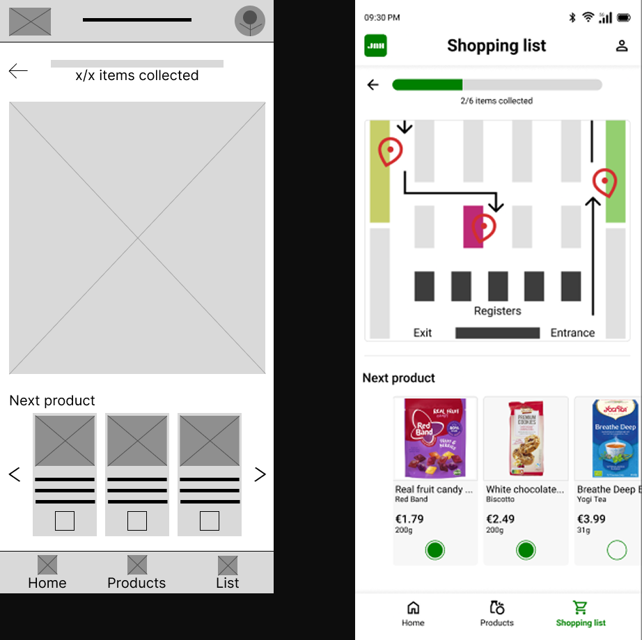
Shopping list route page
10. hi-fi usability study & improvements
High-fidelity usability study
Method: Unmoderated usability study (survey)
Participants: 4
Session duration: 5-15 minutes
Research questions:
What can we learn from the user flow, or the steps that users take to create an in-store shopping route?
Are there parts of the user flow where users get stuck?
Are there more features that users would like to see included in the app?
Do users think the app is easy or difficult to use?
Affinity diagram
Actionable insights & Improvements
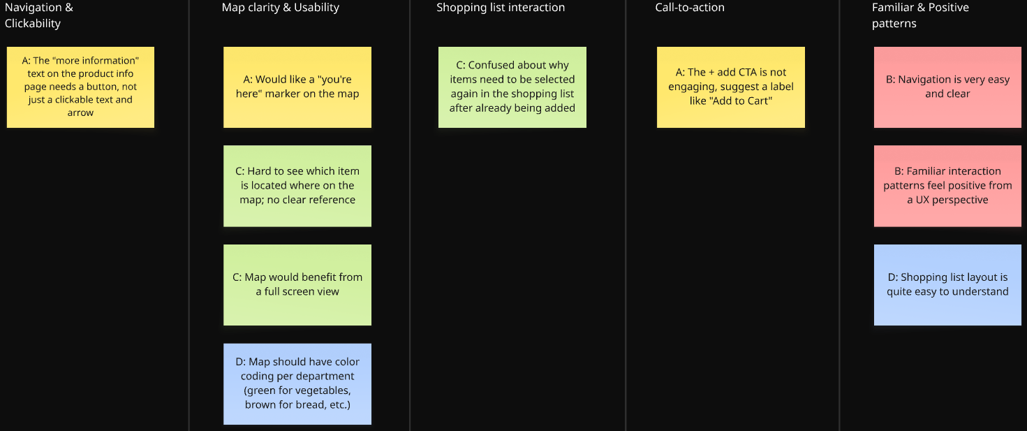
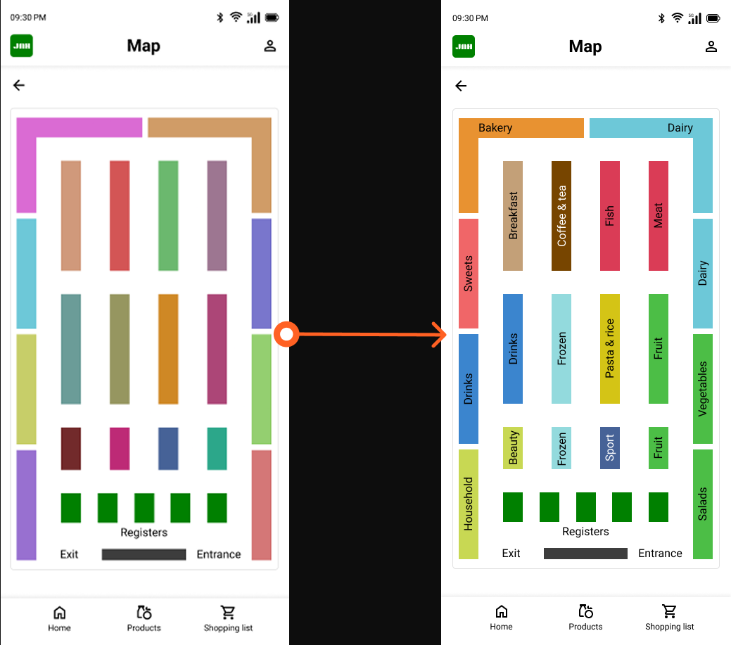
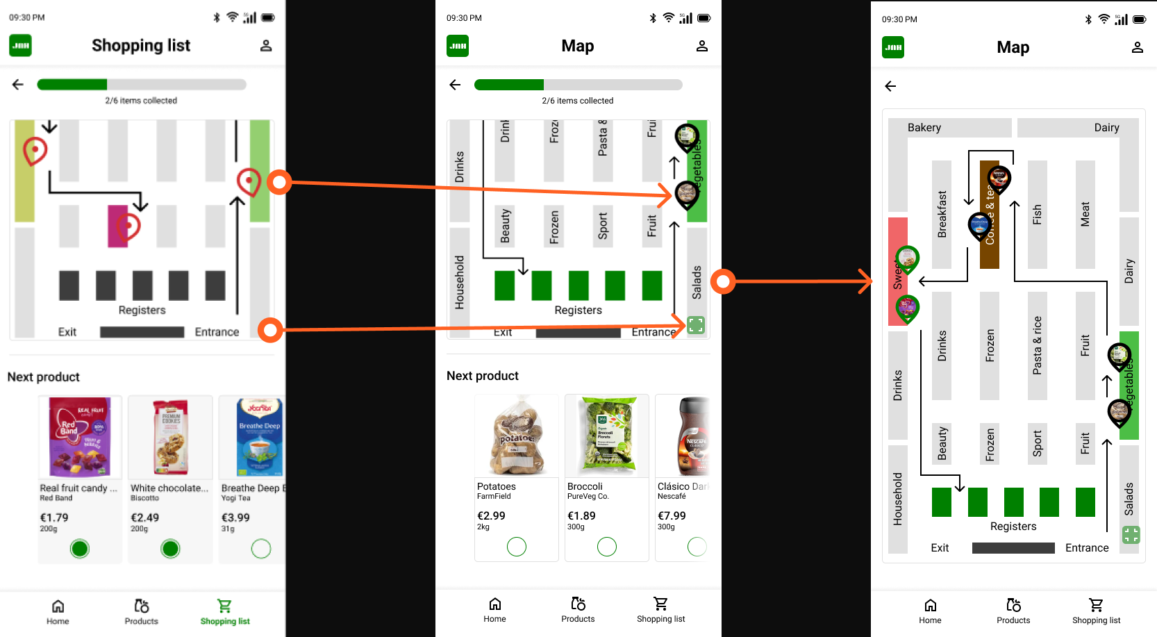
Insight 01: The map lacks visual clarity, making it difficult to locate products in-store
Users struggle to understand where their products are on the map because there is no color coding per department, no "you are here" indicator, and no full screen view to properly orient themselves.
Action: Users need a clearer, more informative map with department color coding, a current location indicator, and a full screen view option.
Improvements
The map now includes labeled aisles, and each section is color-coded to match the product categories (e.g., green for fruits, vegetables, and salads; light blue for frozen items; and yellow for pasta and rice). This helps users quickly understand the store layout at a glance.
Pins were also made more distinctive by adding small product images inside each pin. Items that have already been collected are outlined in green, while items still on the list are outlined in black. Additionally, an expand button was added to the bottom-right corner of the map, allowing users to enlarge the view and see the full store layout and route at once.
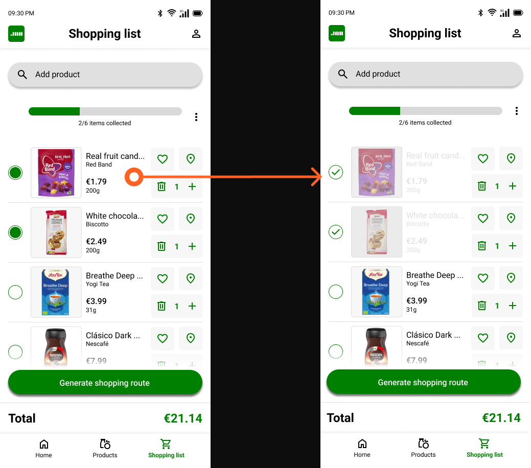
Insight 02: Users are confused about why they need to select items again in the shopping list
After adding products to their shopping list, users do not understand why they need to select items again before generating a route, as this step feels redundant and unexplained.
Action: Users need clearer guidance or visual feedback that explains the purpose of selecting items before generating a shopping route.
Improvements
To make it clearer which products have already been collected, the product image and description are displayed in light gray once an item is checked off. This makes it easier and faster to distinguish between collected and remaining items. Additionally, the green indicator dot was replaced with a checkmark to provide a clearer visual confirmation that a product has been collected.
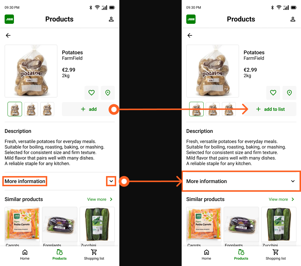
Insight 03: The "more information" section is not clearly interactive
Users expect the "more information" text on the product page to be fully tappable, but only the arrow on the right side responds to interaction, creating confusion about what is clickable.
Action: Users need the entire "more information" row to be interactive, not just the arrow icon.
Insight 04: The ‘+ add’ button does not clearly communicate its action
The ‘+ add’ icon alone is not engaging or descriptive enough for users to immediately understand that tapping it adds the product to their shopping list.
Action: Users need a clearly labeled button that communicates the action of adding a product to the shopping list.
Improvements
The original “+ Add” button was replaced with a “+ Add to list” button to more clearly indicate where the product will be added. Additionally, the separate “More information” and arrow-down buttons were combined into one full-width button. This change makes it clearer and easier for users to access additional product information.
11. Learnings
What went well?
Looking back on this project, I am proud of what I was able to create as my first UX design project. Starting from scratch, with no prior experience in UX, and working through the full design process from research and ideation to a tested, high-fidelity prototype felt like a significant achievement.
One thing I am particularly proud of is the iterative process I followed. Rather than jumping straight to a final design, I took the time to test my lo-fi prototype with real participants, synthesize the findings into actionable insights, and carry those improvements into the high-fidelity design. Running two complete usability studies and actually using the results to inform design decisions, gave the final product a foundation that goes beyond personal preference.
The final design reflects not just my own vision, but the feedback of real users who interacted with the prototype at two different stages of the process.
What would i do differently?
There are a few things I would approach differently if I were to do this project again. The most significant is the absence of real user research at the start of the process. Because this project originated from a predefined course brief rather than a real-world problem, conducting prior user research was not a natural starting point. However, in a professional context, I would always begin by speaking to real users before defining pain points or creating personas, rather than relying on assumption-based proto-personas as I did here.
I would also aim to include more participants in each round of usability testing. With three participants in the lo-fi study and four in the hi-fi study, the sample sizes fell below the commonly recommended minimum of five participants per round. While the studies still surfaced valuable insights, a larger group would have provided more reliable and representative findings.
Finally, if this had been a real project for an actual supermarket chain, I would have ensured that the usability study participants were existing customers of that specific supermarket. Testing with users who are already familiar with the supermarket would have produced more relevant and actionable feedback than testing with general supermarket shoppers.
Next steps
If this project were to continue, the most important next step would be to validate the assumptions that currently underlie the personas and pain points. This would mean conducting real user interviews with supermarket shoppers to confirm whether the identified pain points accurately reflect their experiences, and refining the personas based on actual data rather than assumptions.
A natural follow-up would also be to test the final high-fidelity prototype with a larger and more targeted group of participants, specifically regular shoppers of the supermarket the app would be designed for. This would help surface any remaining usability issues that the current studies may have missed due to the limited sample sizes.
Finally, if the app were to move towards development, designing for additional screen sizes such as tablet would be a logical next step, ensuring the experience remains consistent across devices.